Coffee Shop Analysis in Excel

I evaluated transaction records for Maven Roasters, a fictitious coffee shop operating out of three NYC locations. Dataset includes the transaction date, timestamp and location, along with product-level details.
Overview
Software: Excel
Skills: Pivot Tables, Pivot Charts
Familiarize Thyself with Thy Data
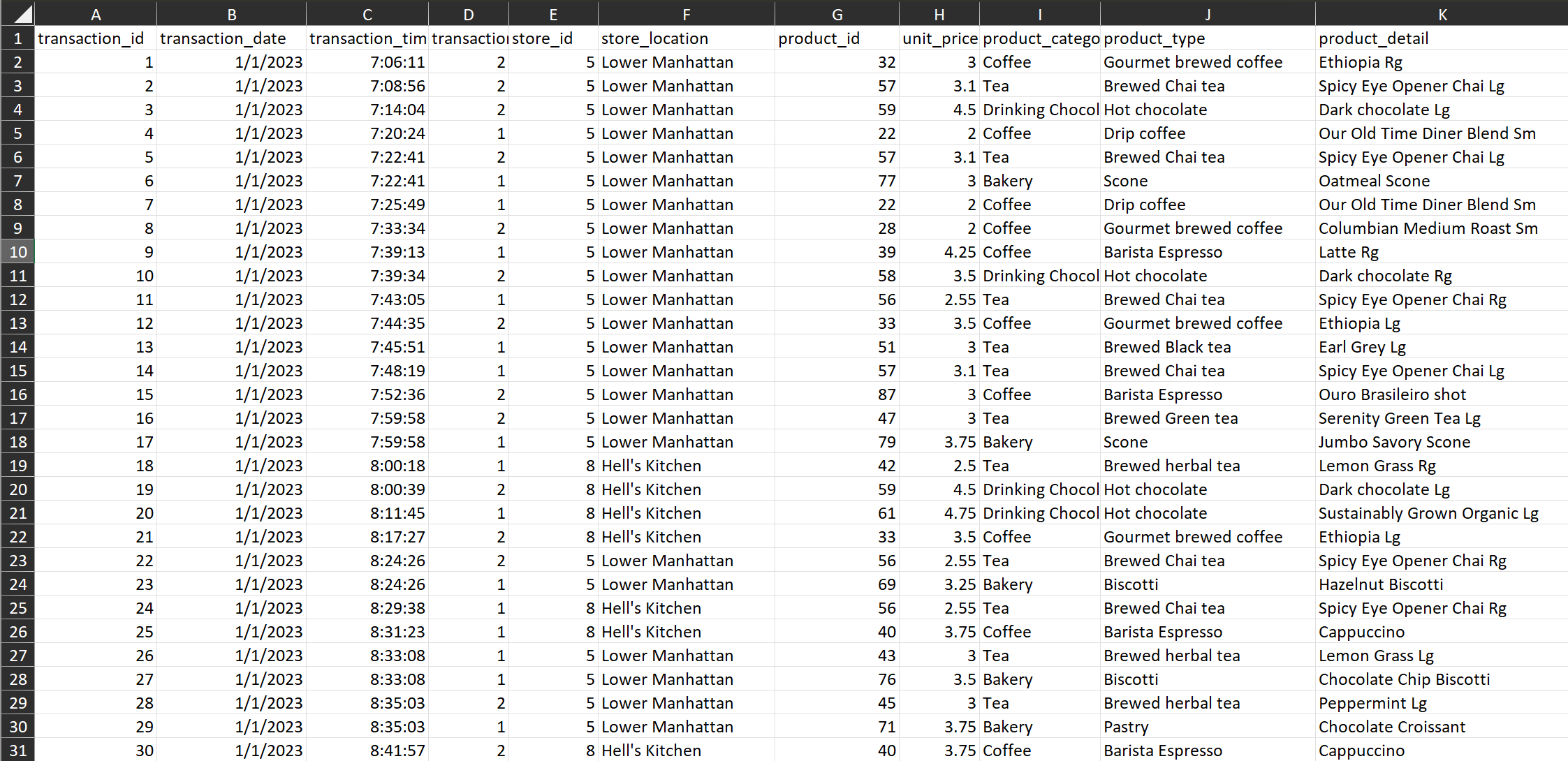
My first approach with this project was to familiarize myself with the data table.
Upon first glance, I noticed everything was organized into one table. Each row is associated with a unique transaction_id, and there are 149,456 rows in total.
Through glancing at the transaction_date field throughout the rows, I can see that this data traverses January 1, 2023 to June 30, 2023.
This data is also across three different store locations and includes product information as well as transaction information.
There doesn’t appear to be any data cleaning needed, as everything is formatted and spelled correctly.
Questions to Answer
- How have Maven Roasters sales trended over time?
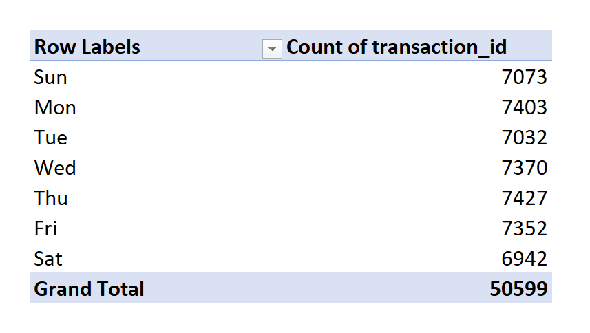
- Which days of the week tend to be busiest, and which are the slowest?
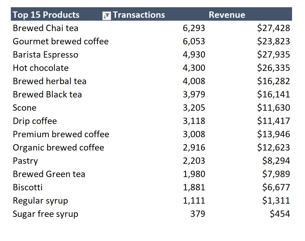
- Which products drive the most revenue for the business?
Create Columns for Digging Deeper
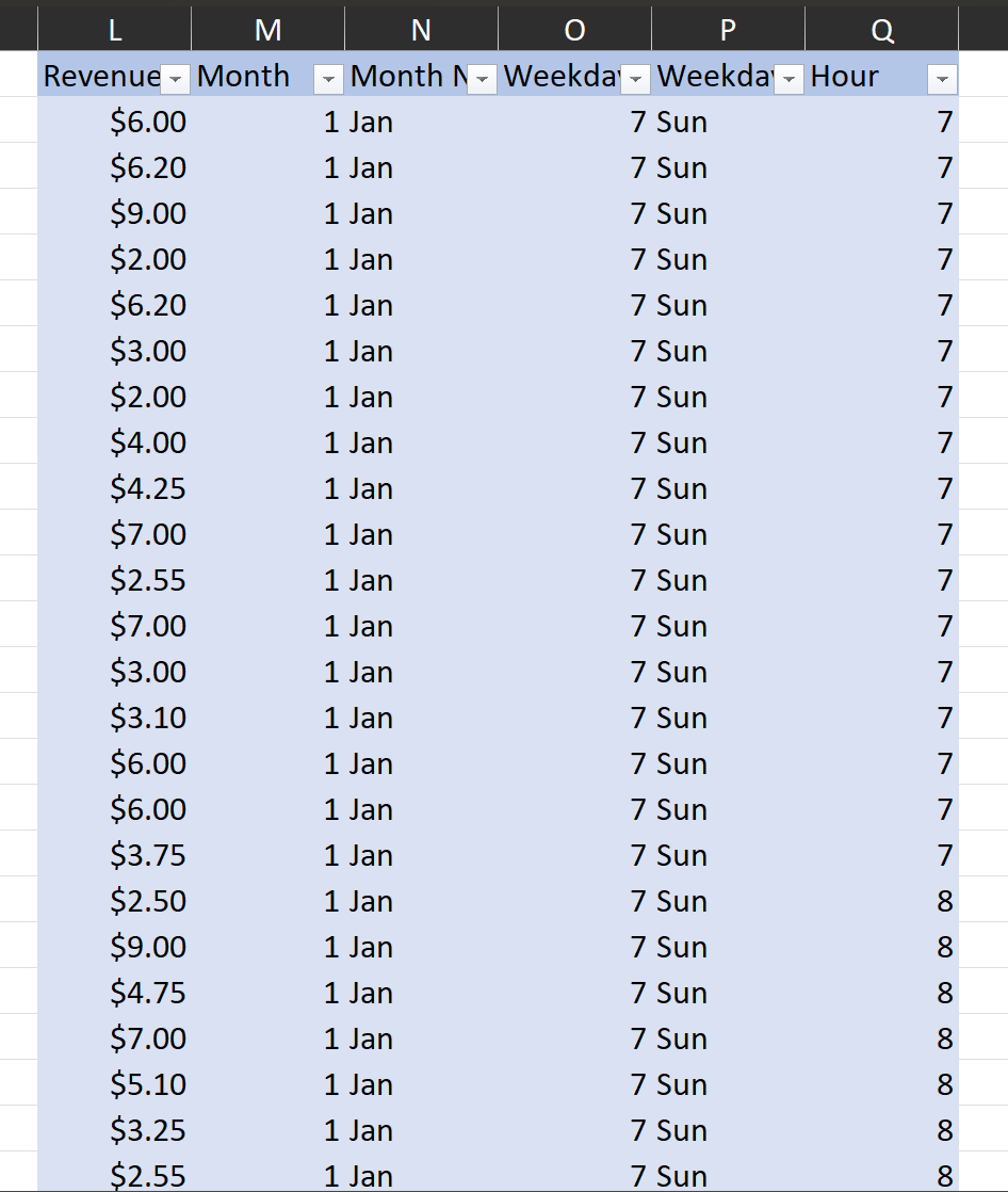
Revenue Column:
Transaction_qty * unit_price
This column lists the revenue created for each transaction.
Month Name Column:
I extracted the month from the transaction_date column using this formula:
=TEXT(B2,"mmm")
Weekday Name Column:
I extracted the weekday name from the transaction_date column using this formula:
=TEXT(B2,"ddd")
Hour Column:
I extracted the hour from the transaction_time column using this formula:
=HOUR(C2)
For every column value listed above, I forced the formula down on each row of each column. This allowed me to create values based on information in each row.
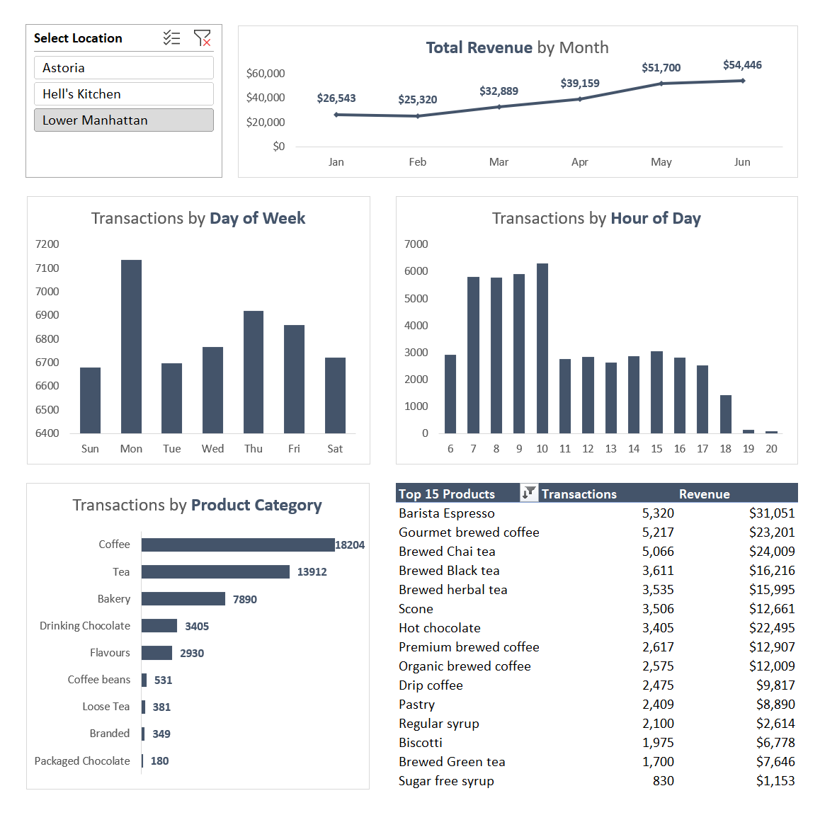
Pivot Tables and Pivot Charts
After creating these additional columns to add supporting information to the pivot tables/columns, I created 5 pivot tables to start looking closer at the data.
The first four pivot tables I created allowed me to create pivot charts for the specific data I wanted to see.
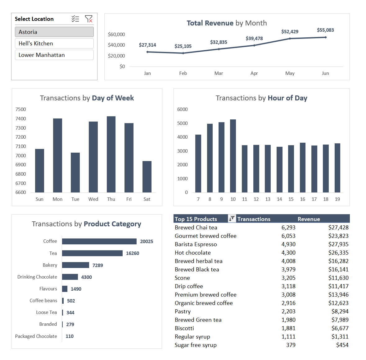
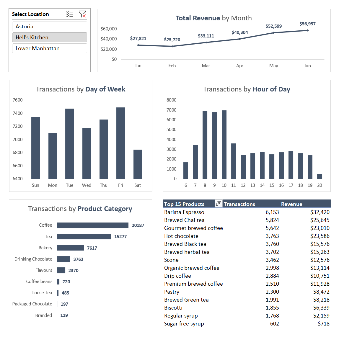
Afterwards, I put everything together in one cohesive dashboard. I added a filter based on the coffee shop location that adjusts for all of the dashboard charts and tables.
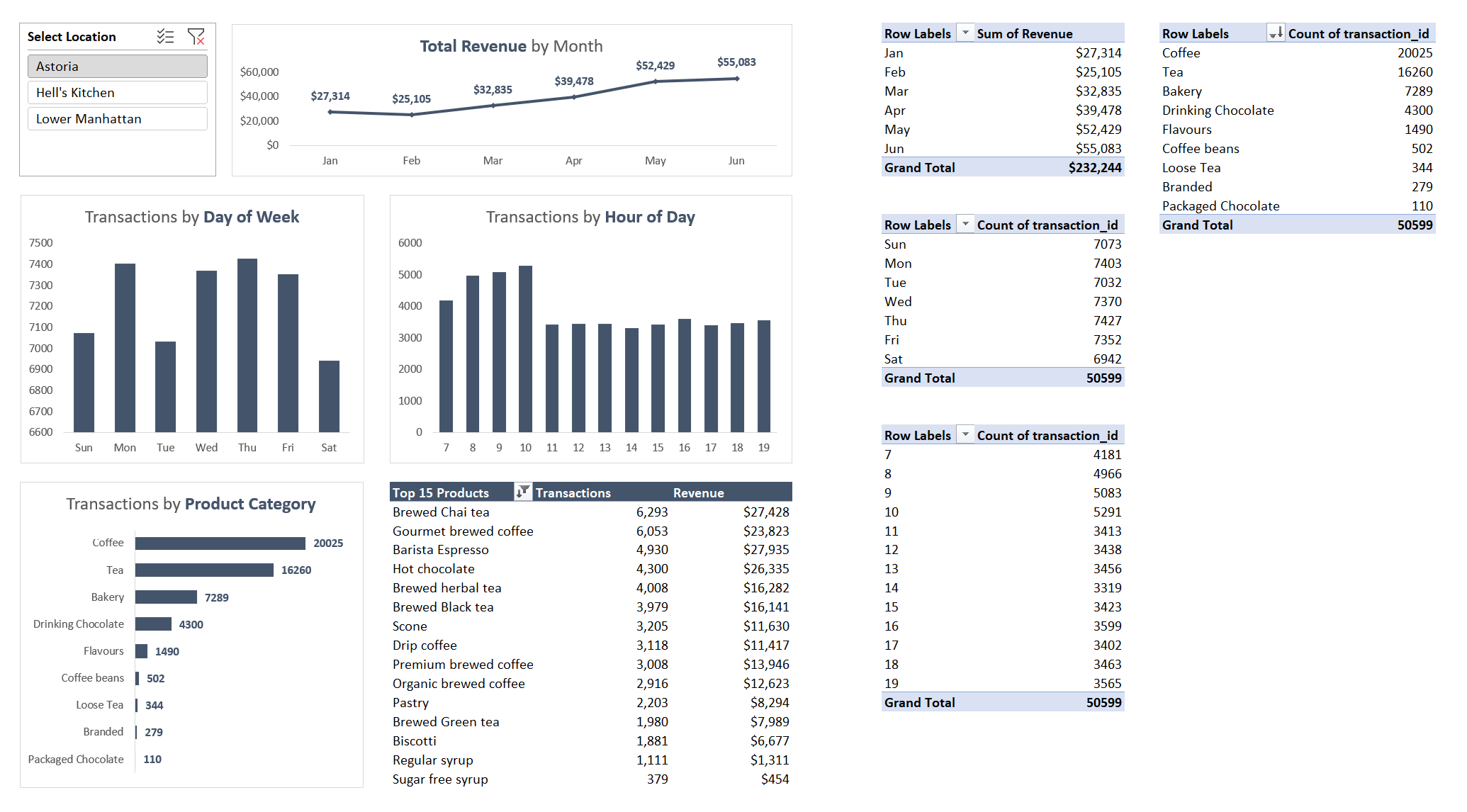
Initial Insights
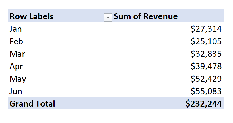
- Every location increased their revenue from January to June.
- The top 3 products at every coffee shop location were
- Brewed Chai tea
- Gourmet brewed coffee
- Barista Espresso
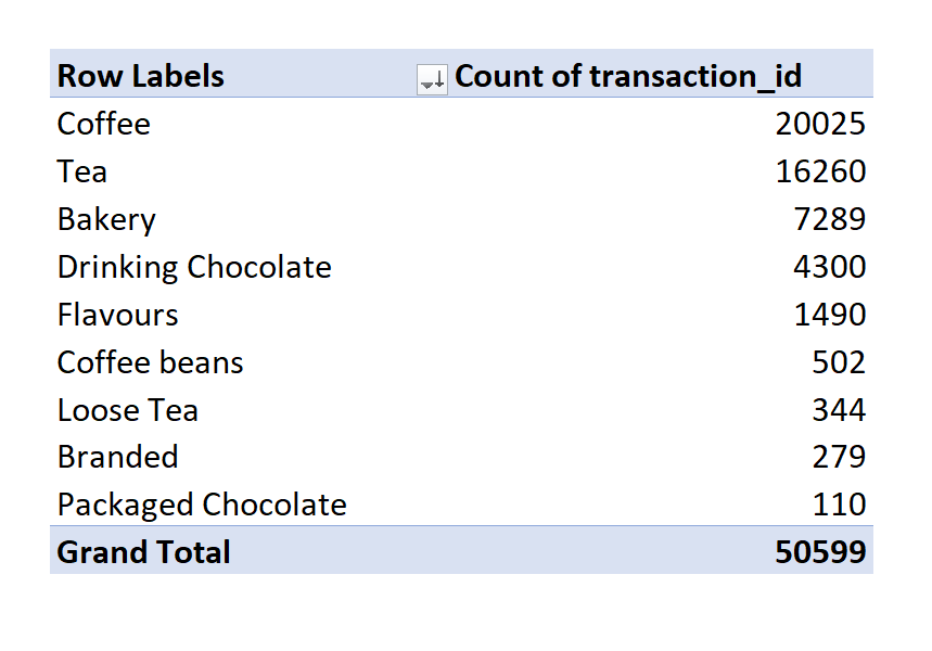
- Coffee had the most transactions by category at every coffee shop location.
Suggestions by Location
Astoria
- Astoria’s location is doing well overall, but I would suggest re-evaluating the store hours for Saturday’s. This is the slowest day and they could lower overhead costs by only being open during their most popular hours.
Hell’s Kitchen
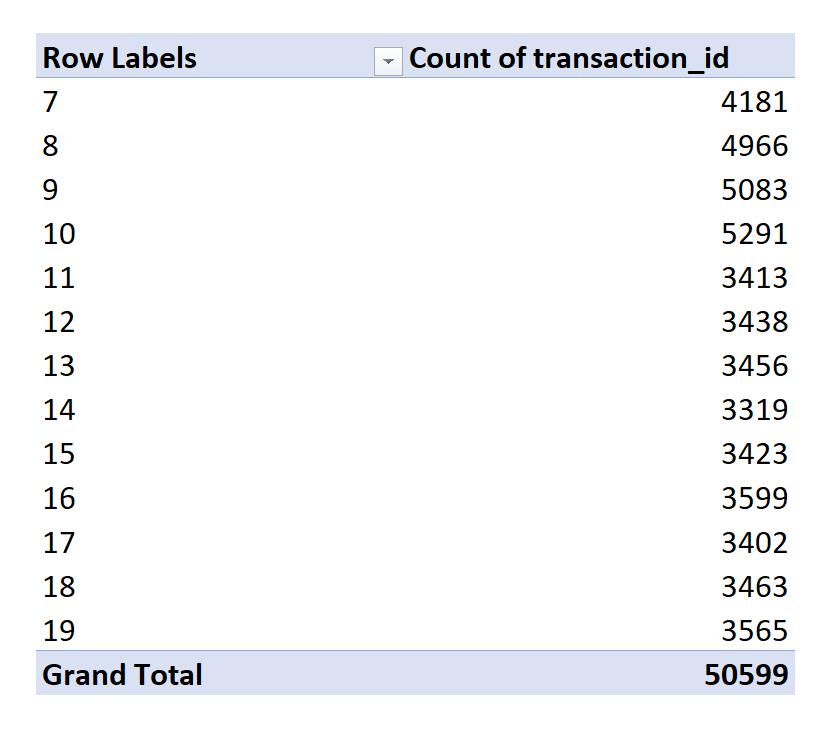
- Hell’s Kitchen location’s transactions tapers off significantly at 8:00pm, they could close this location early and not lose much revenue.
- Hell’s Kitchen’s busiest hours are between 8 and 10 am. I would suggest adding promotions during this time, and increasing staff during this time.
Lower Manhattan
- Lower Manhattan’s transactions start to slow down at 7:00pm and they are open until 9:00pm. They could close this location earlier and focus on their high sale numbers between 7 and 10 am during the morning rush hours.
- Lower Manhattan sees a huge spike in sales on Monday’s, they could take advantage of strategic promotions to increase revenue during Monday’s.