UX Coffee Shop Design Case Study
I interviewed six participants about their habits when visiting coffee shops, and when mobile ordering from an app. Participants that enjoyed using mobile apps for ordering enjoyed having the ability to select their item, potentially customize it, and earn rewards. From this initial study on coffee shop related habits, I concluded…
Overview:
Timeline: 3 months
My Role: UX Researcher/Designer
Team: Self-Directed
Platform: Figma
The Main User Needs
- Order coffee for pickup
- Browse online menu
- Earn rewards for purchases
- Customize drink orders
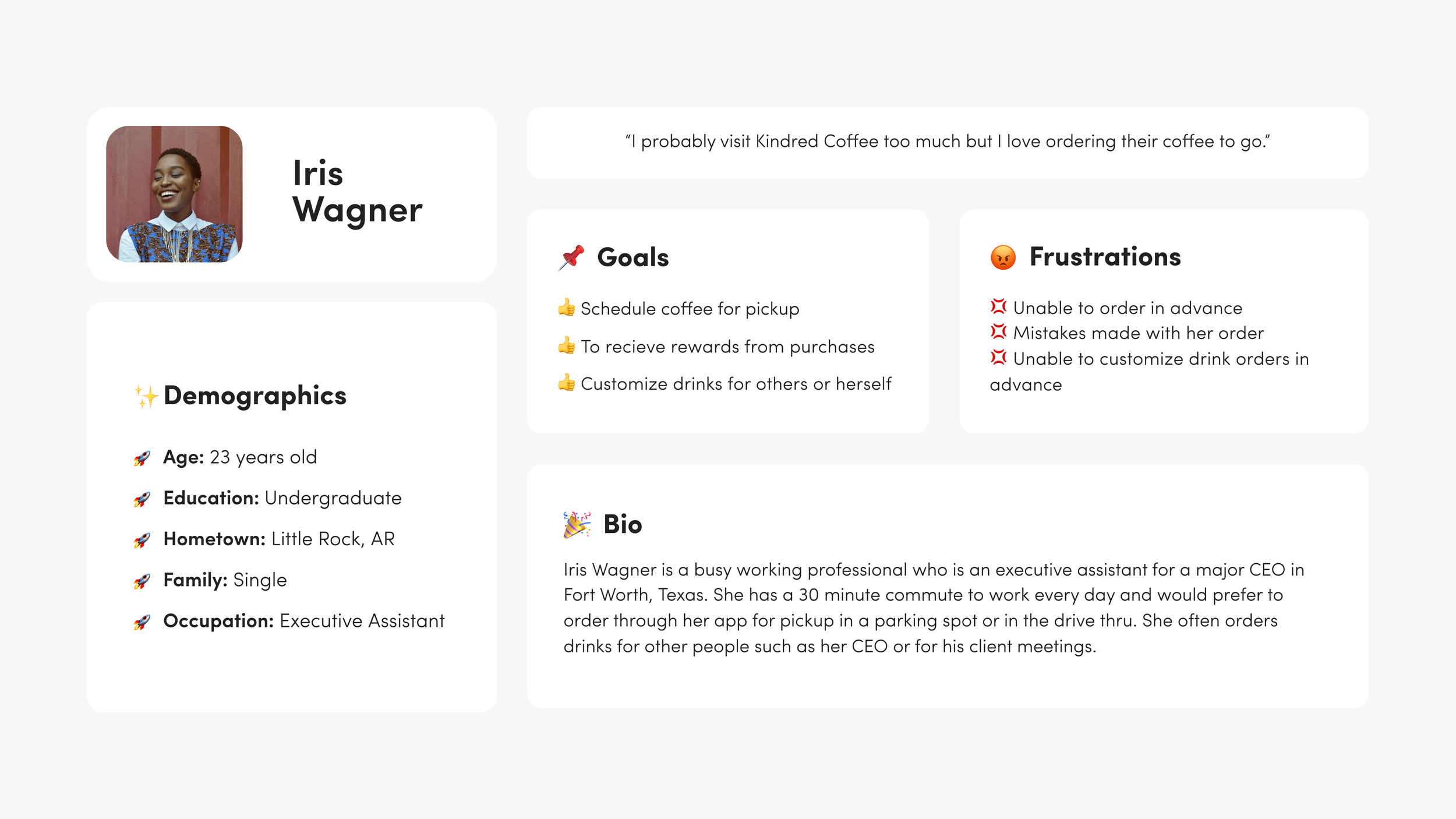
User Persona
Understanding the customer is crucial in an app design process. I created this persona from gathering research through user interviews with a user group who visit local coffee shops frequently. I incorporated those user research insights into this user persona.
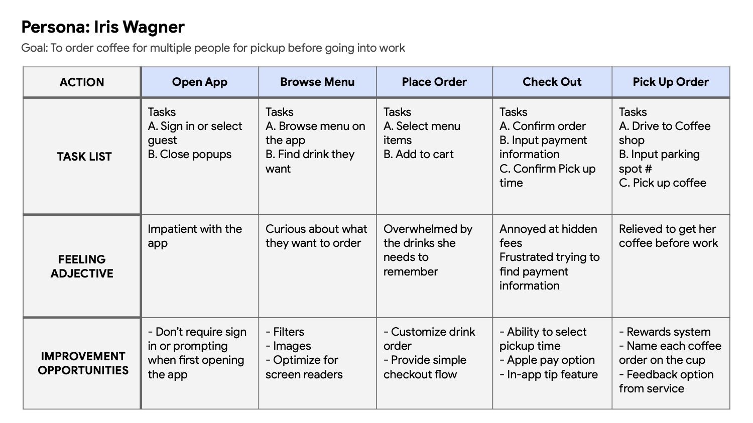
User Journey Map
After creating a user persona, I also created a user journey map to help me understand the tasks that Iris needed to complete within the app.
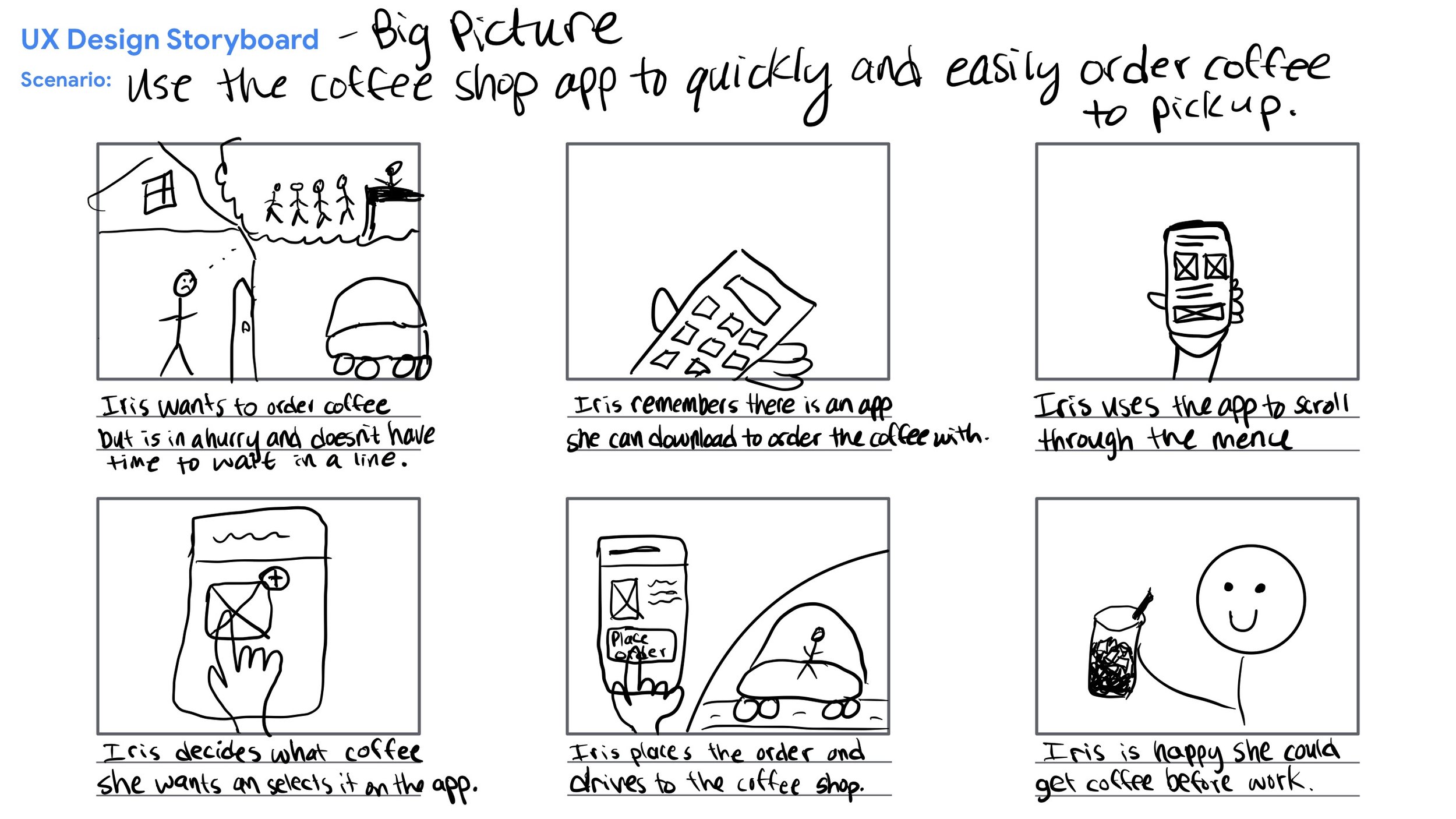
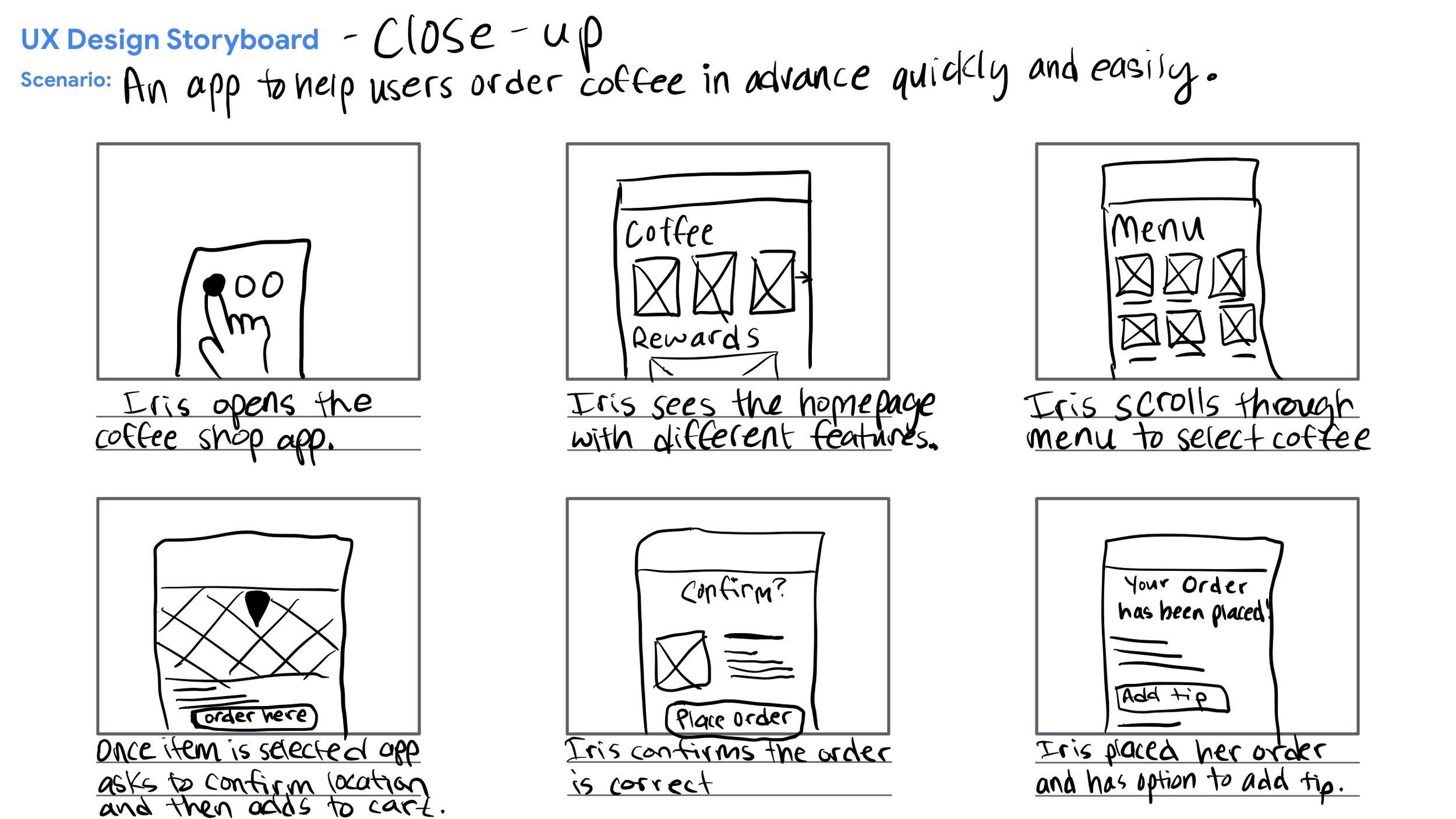
User Storyboards
I also found Storyboards helpful for mapping and understanding the user journey as the use the Kindred Coffee shop app.
Competitive Audit
There are many different coffee shop apps already on the market. To understand what other apps are doing well and not so well, I conducted a competitive audit. I conducted research with direct competitors including Starbucks, Dutch Bros, Dunkin’ Donuts, and Black Rifle Coffee Co., as well as indirect competitors including Chick-Fil-A and Sonic.
Overall this research was done to determine best practices and potential pitfalls to avoid from my competitors.
Best Practices
- Ability to order and customize order within app
- Scan app or purchase within app to receive rewards
- Visually appealing, good use of white space
- Clear brand identity
Pitfalls
- Small pictures and text
- Use of colors not accessible for all users
- Hierarchy confusing, no search available for menu options
- Verbiage that only targeted one user group
Wireframes
For the homepage of the app, I sketched out a few different options and combined some of the screens into a final first draft of the homepage design.
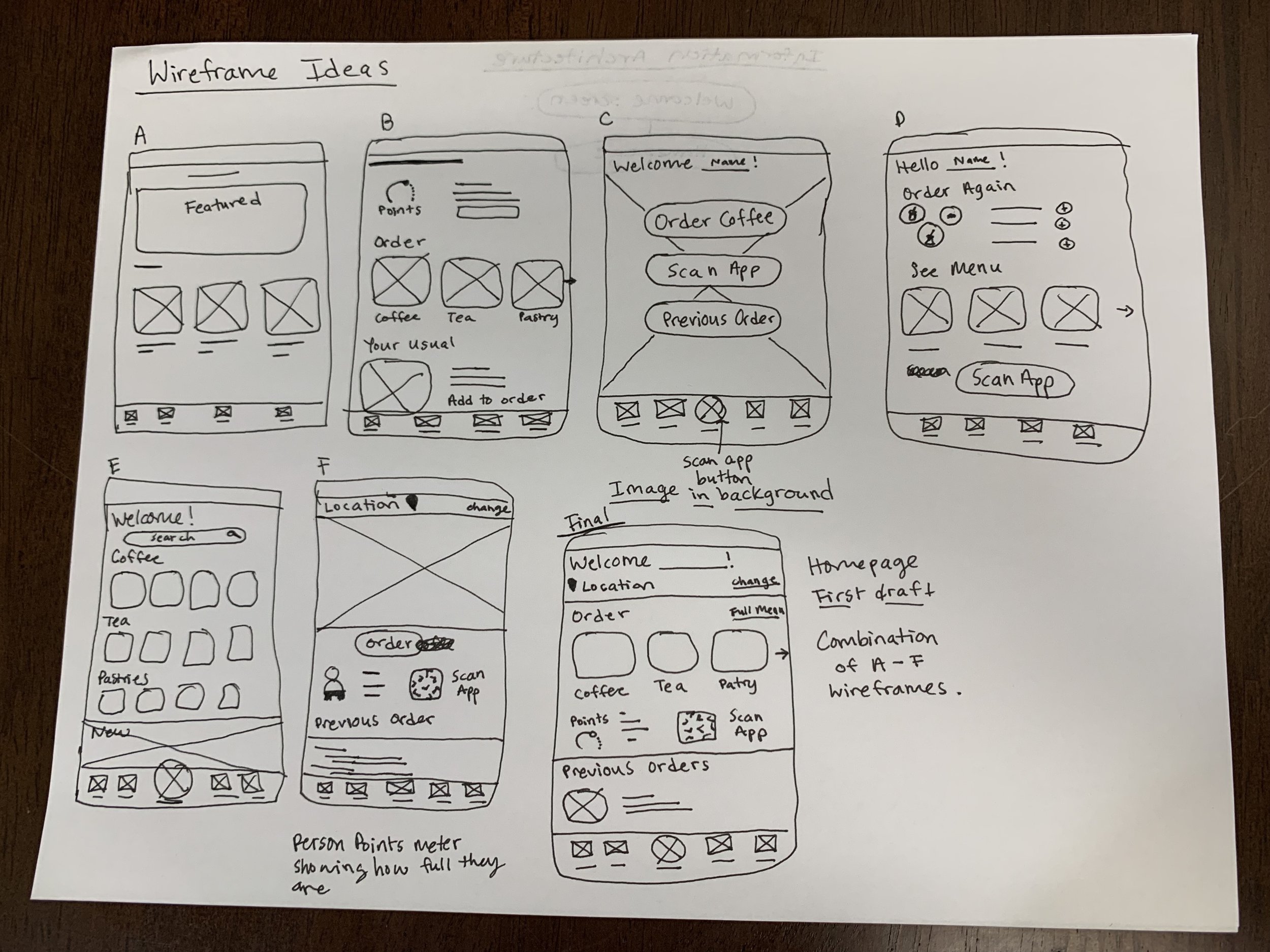
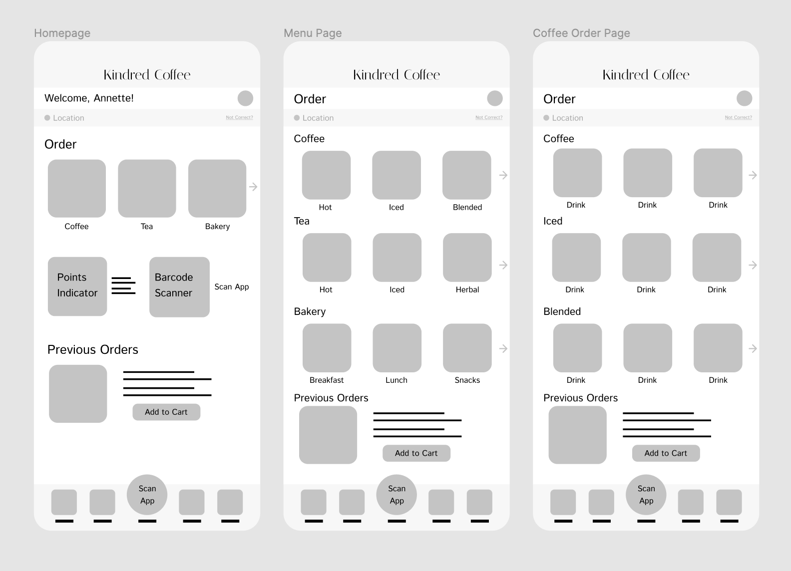
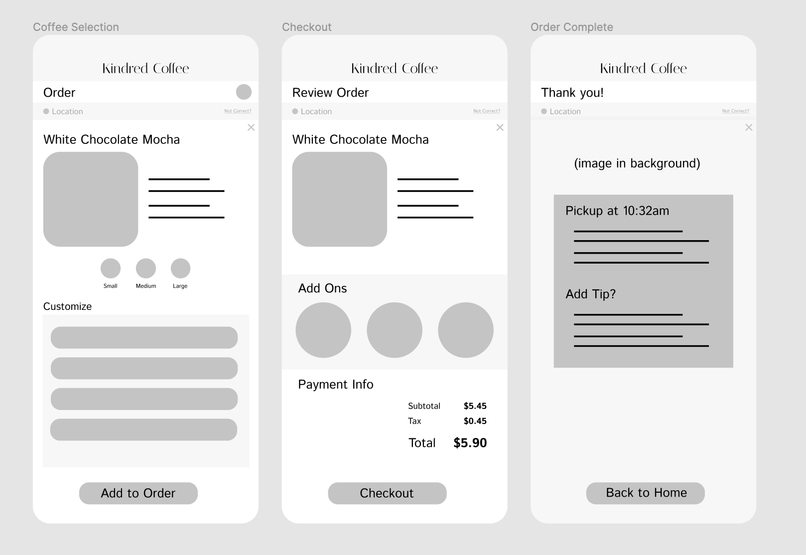
Then I created some low fidelity wireframes on Figma to represent the main user flow within the app.
Low-Fidelity Prototype
Then I created a low-fidelity prototype to gather research from 5 potential users to gather feedback and iterate on my designs.
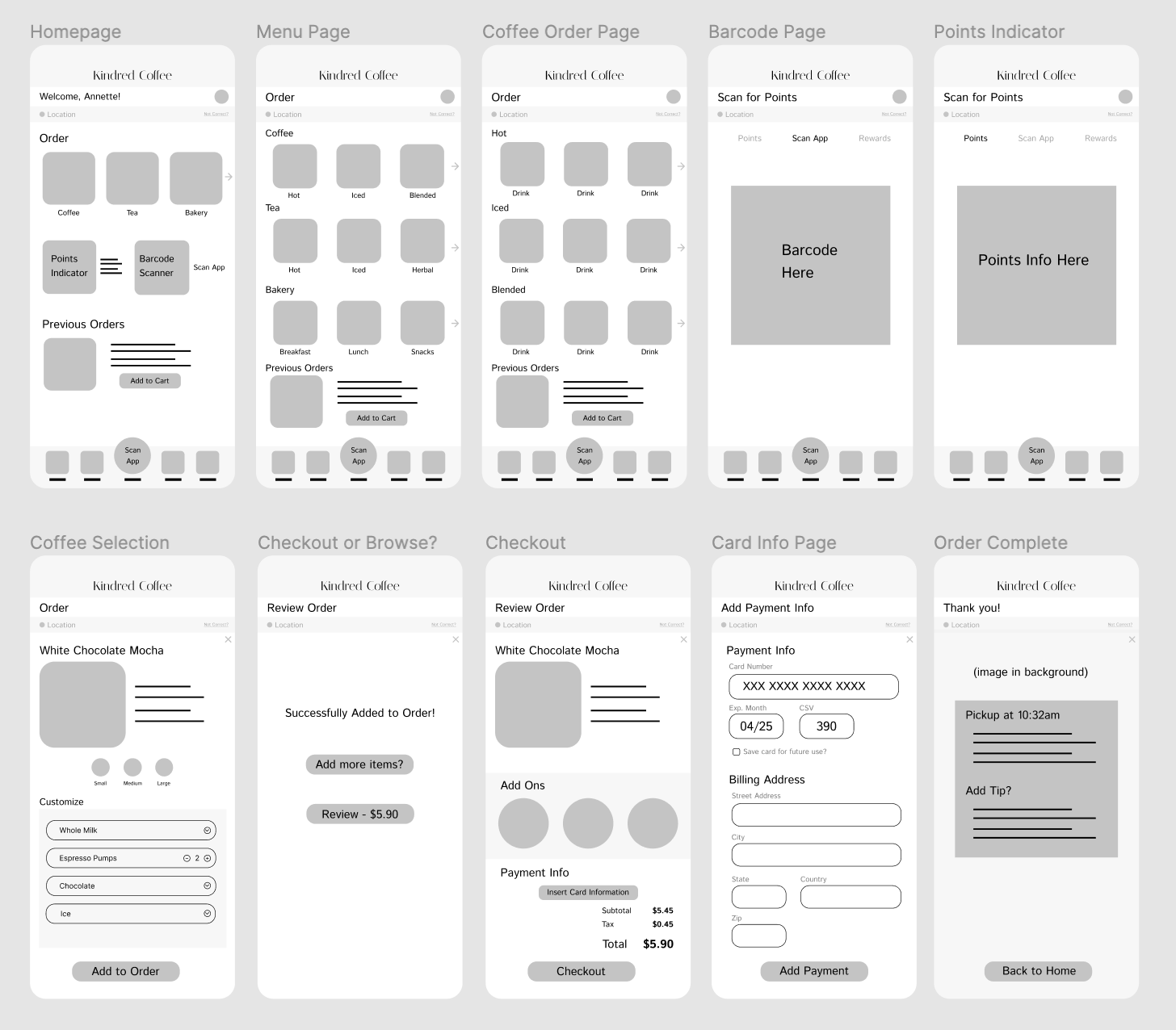
After User Research with the Low-Fidelity Prototype
I discovered the following user needs:
- Better clues on how to get to the homepage
- To be able to use the customize feature
- To see the specific item they selected is being ordered
- Payment information to be larger on mobile device and more understandable
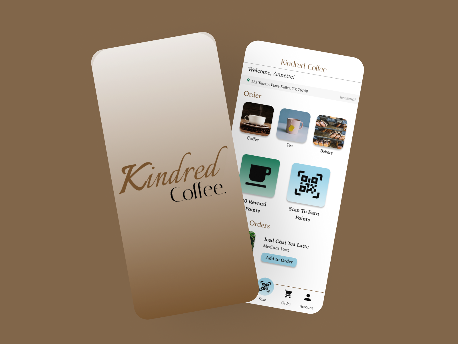
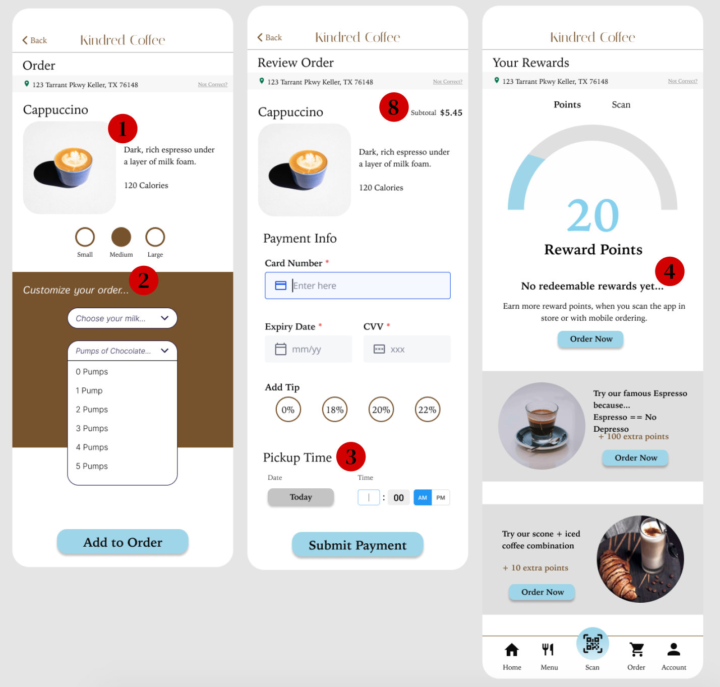
Hi-Fidelity Prototype
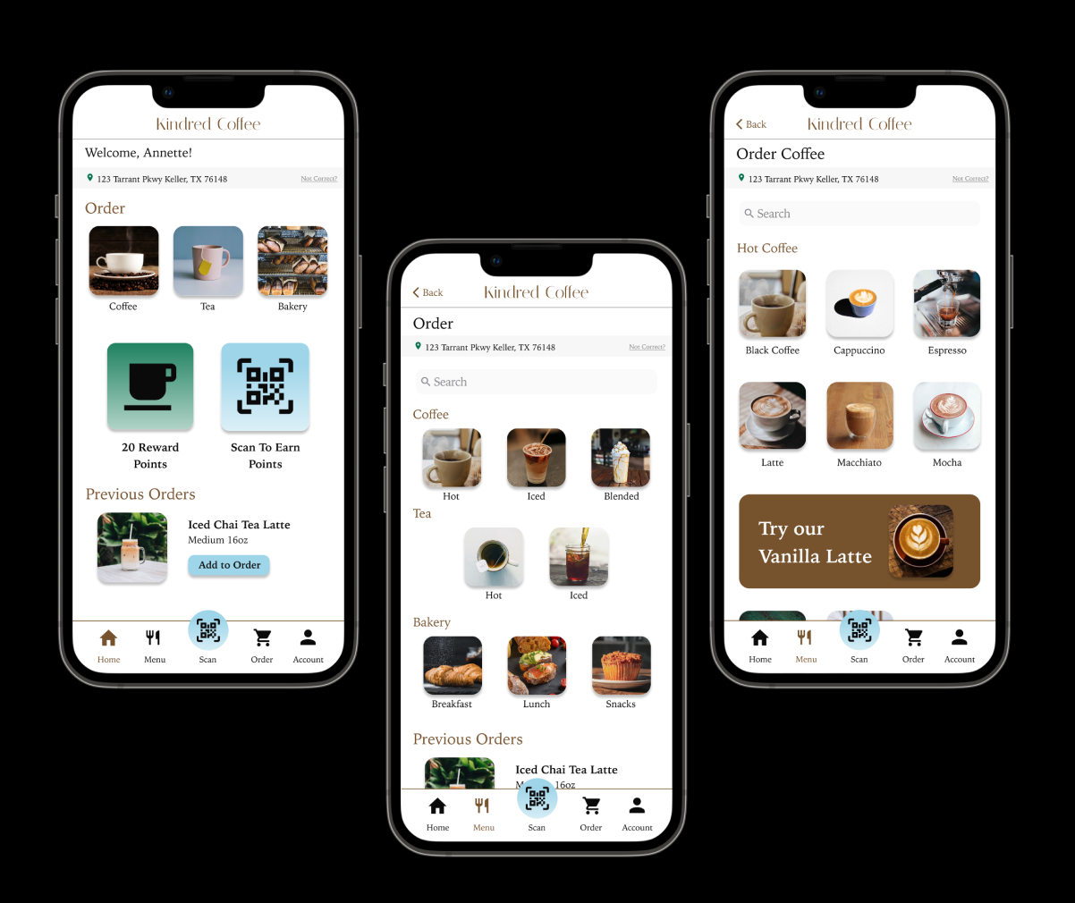
Interact with the Hi-Fidelity Prototype
User Research with Hi-Fidelity Prototype
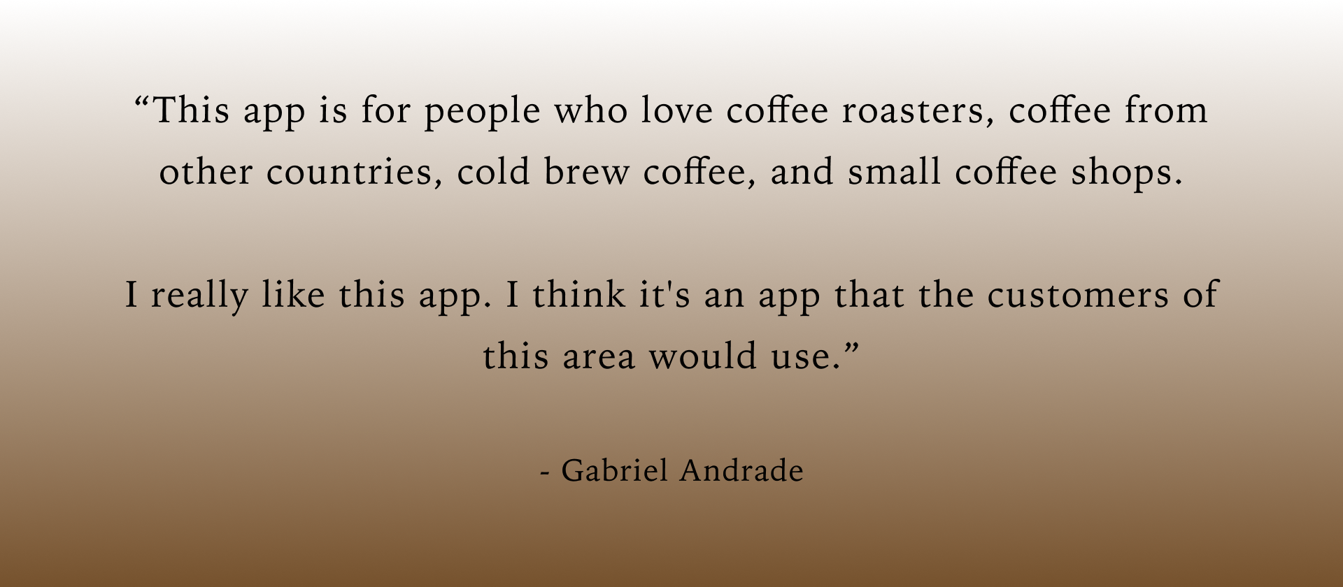
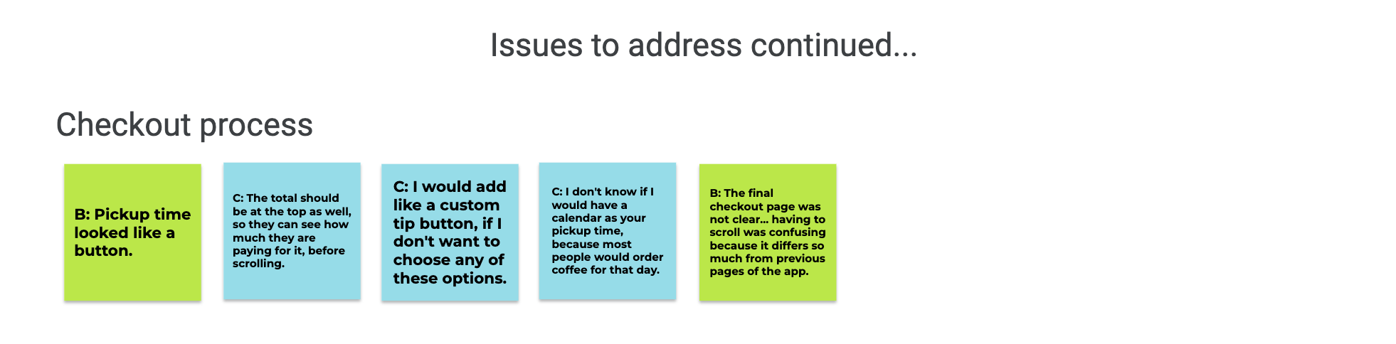
Overall, users were pleased with the design functionality and aesthetic of my coffee shop app.
Although, through affinity mapping I found critical issues to address within the app…
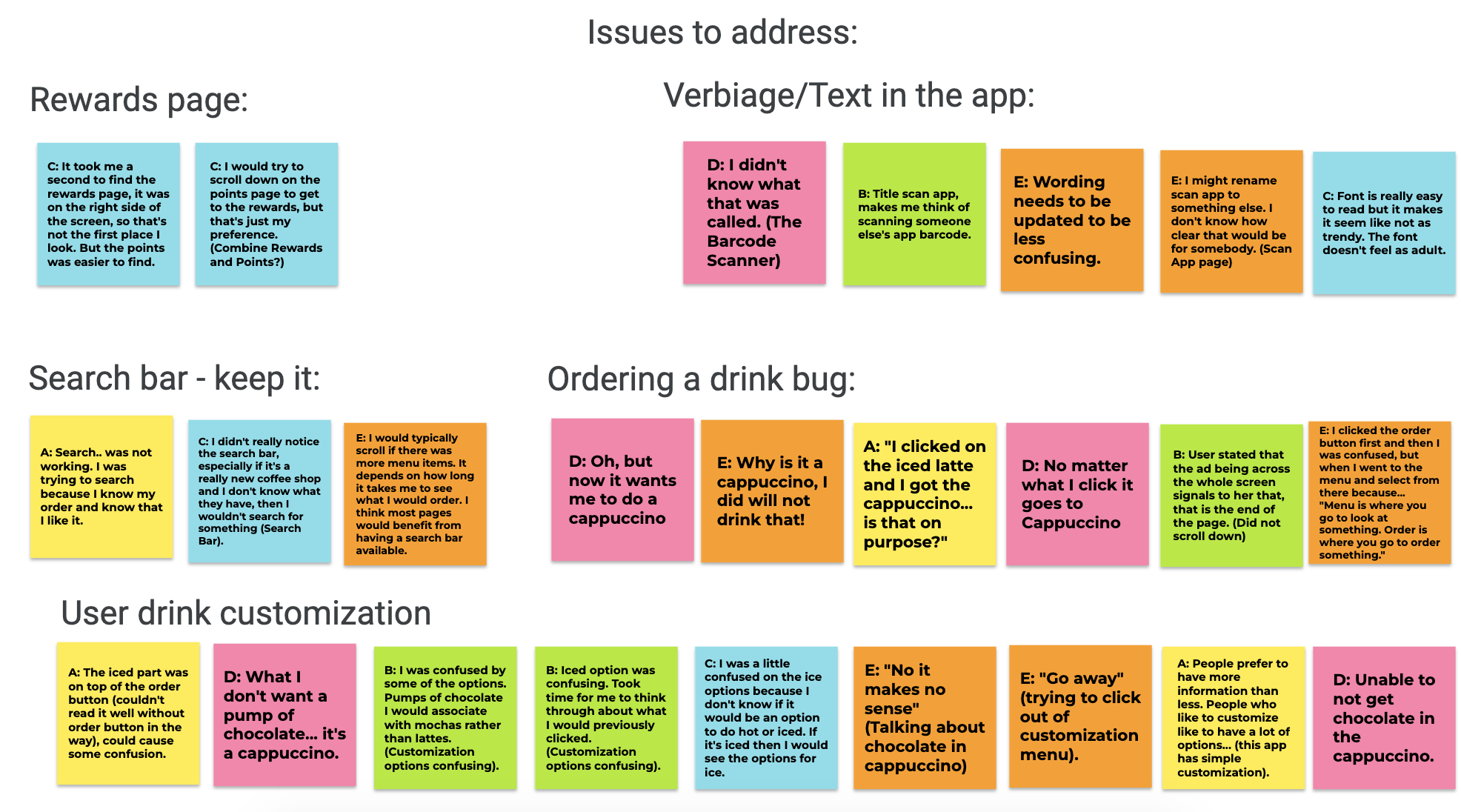
App Changes and Improvements
Insights from Affinity Map - Level 1 Priority (1-6)
- User is able to order the item they want instead of just a cappuccino
- Customization is displayed with options that are only related to the type of drink. Clear option for no additional customization as well (0 pump options).
- Change pickup time input - takes up a lot of screen space, not clear that you need to scroll down
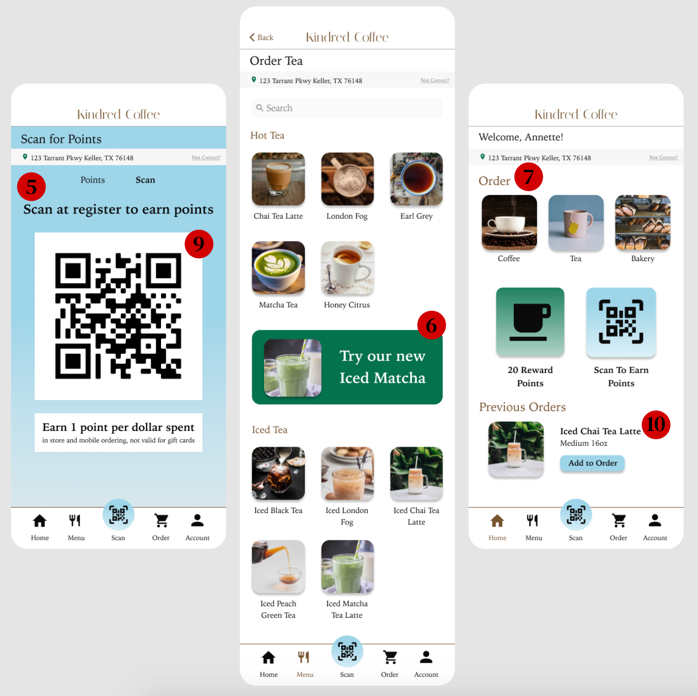
- Combine rewards and points page - add rewards underneath points progress bar
- Change verbiage to make scan app button clear
- Change ads in menu to better resemble button
Insights from Affinity Map - Level 2 Priority (7-10)
- Change font in app to a more sophisticated typeface
- Customer subtotal should be displayed at top of checkout page
- Change barcode page to a real QR barcode
- Change 16oz drink to medium, not small
Recommendations for next app update:
- Add custom tip input option
- Add input box for drink customization
System Usability Scale (SUS)
My SUS Questions:
- I think that I would use this app frequently.
- I find the app unnecessarily complex.
- I think the app is easy to use.
- I find the app easy to navigate.
- There is inconsistency within the app.
- I feel confident using the app.
- I need to learn a lot of things before I can start using this app.
- The main user flow is clear.
- I found the payment system frustrating.
- I found the ordering process inconvenient.
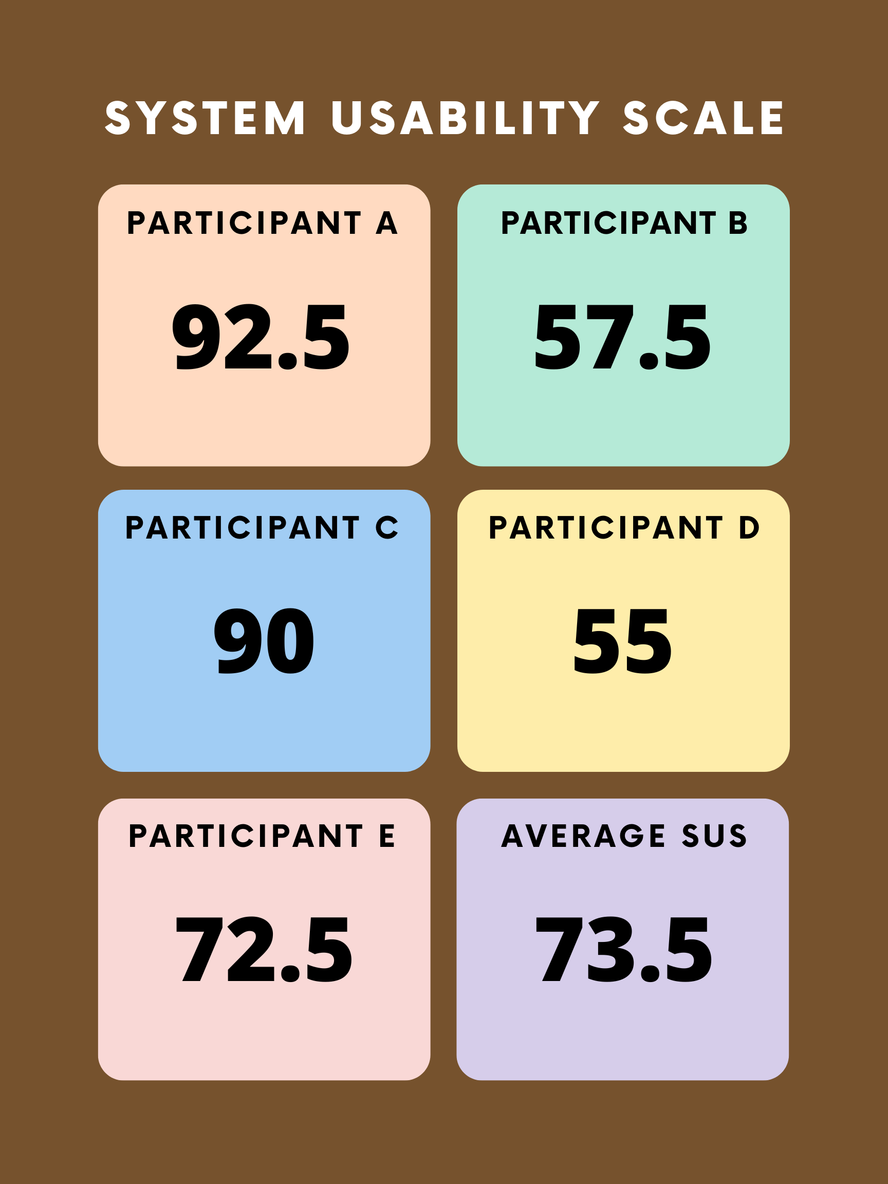
Scoring the SUS
Based on my participant feedback each participant had an overall SUS score:
- Participant A: 92.5
- Participant B: 57.5
- Participant C: 90
- Participant D: 55
- Participant E: 72.5
Average SUS: 367.5 / 5 = 73.5 Overall System Usability Scale
*SUS scoring is based on this article for scoring sus.
Challenges with the Hi-Fidelity Prototype
Prototype not updating to show what the user selected on the order screen
With Figma only being a prototyping tool, I researched how I could make the prototype carry over user data from the menu screen to the order screen. I tried using overlays, however they only allow for one frame to overlay another frame. I decided not to make 50+ frames for each individual order due to potential prototype run-time issues, and excessive/unnecessary work to create all of those individual screens. To develop this app, the user should be able to select the specific item they want, and check-out with that item (or multiple items) on the order screen.
User customization only showing options for certain drinks
To develop this app, I would suggest to developers in the case where the user selects a specific drink, only specific customization options are available. For example, users might not want to put chocolate in their cappuccino, but they might desire to change their milk option. The app should have specific customization options for each drink that may also overlap with other drinks.
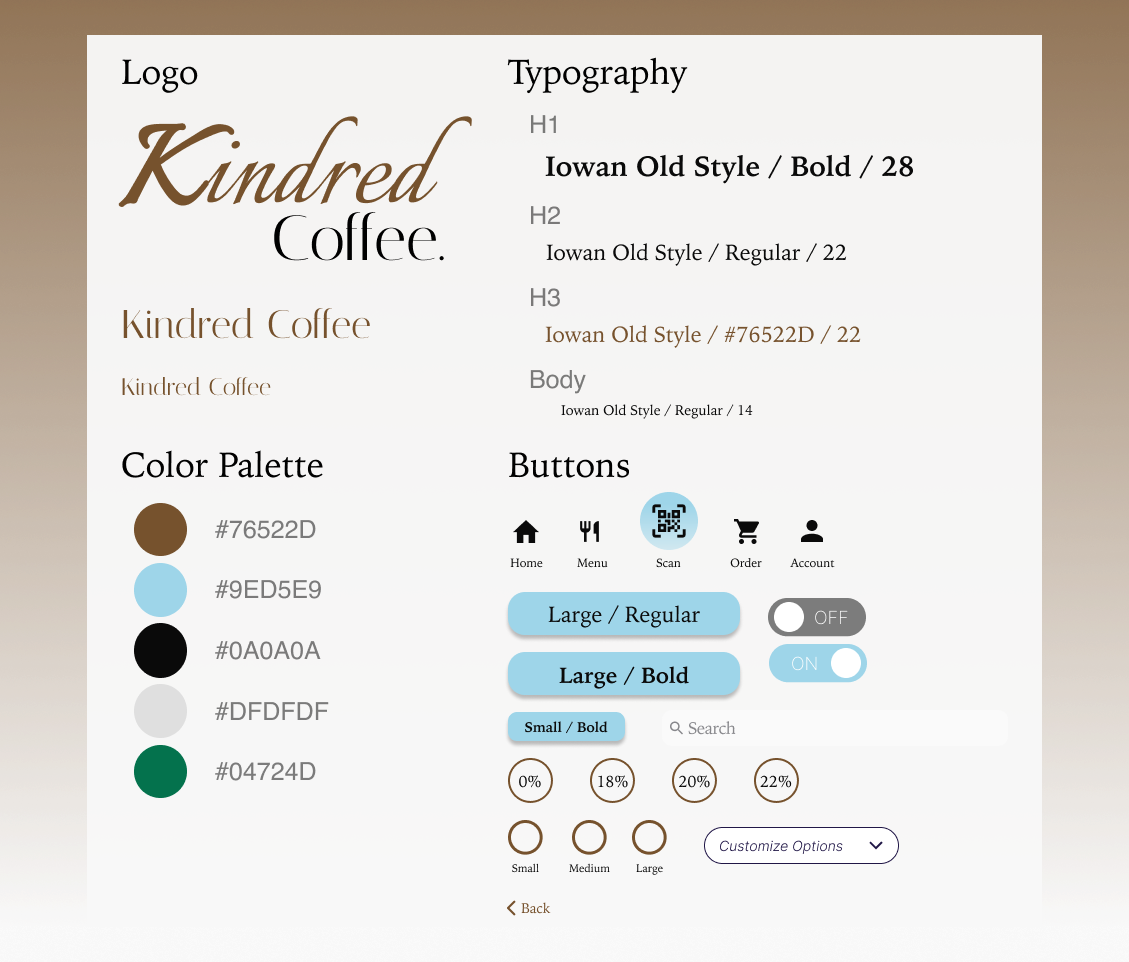
Design System
What I Learned.
- Prototypes are not fully functional, and still have limitations
- Components are very helpful when duplicating icons, buttons, etc. for consistency within the app
- Component Variants are very helpful for prototype interactions, when selecting and deselecting options
- Users prefer to see consistency within the app, and prototypes that will function very closely to an app functionality
- Not everything that seems straightforward to the designer (i.e. scrolling down the page), is always clear to users
- Don’t get so caught up in the details, designs will always be able to be improved and if you strive for perfection over progress, you will never finish your designs.
Interact with the Hi-Fidelity Prototype