VTR Website Redesign
VTR Learning is a premier provider of CPE courses that use a fun and engaging virtual format, so that accountants, human resources professionals, and licensed specialists can collect recertification credits at their own pace through a story-based learning platform.
I was tasked with a full redesign of VTR’s web homepage to meet the needs of users and provide an environment that achieves their goal of having a friendly and professional environment for user’s looking to continue their professional education.
Overview
Timeline: 1 month
My Role: Web Designer
Team: Self Directed, with guidance from mentor
Platform: Figma
Problem Statement
Users needed courses for their continued education that are easy to access, friendly, and applicable to recertifications in their industry from a resource that is welcoming and accredited.
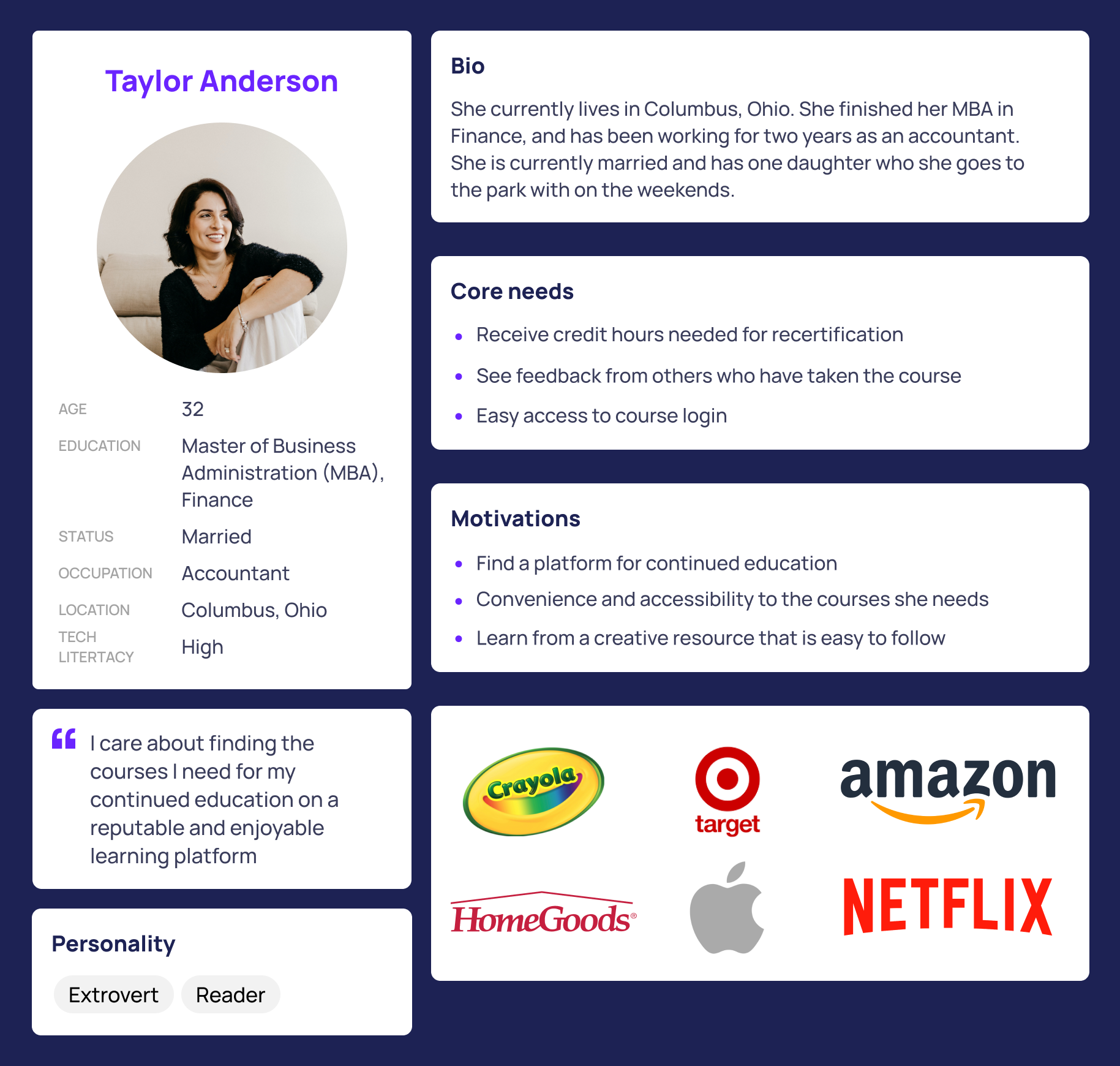
User Persona
I created a user persona that formed a foundation for users throughout the rest of the project.
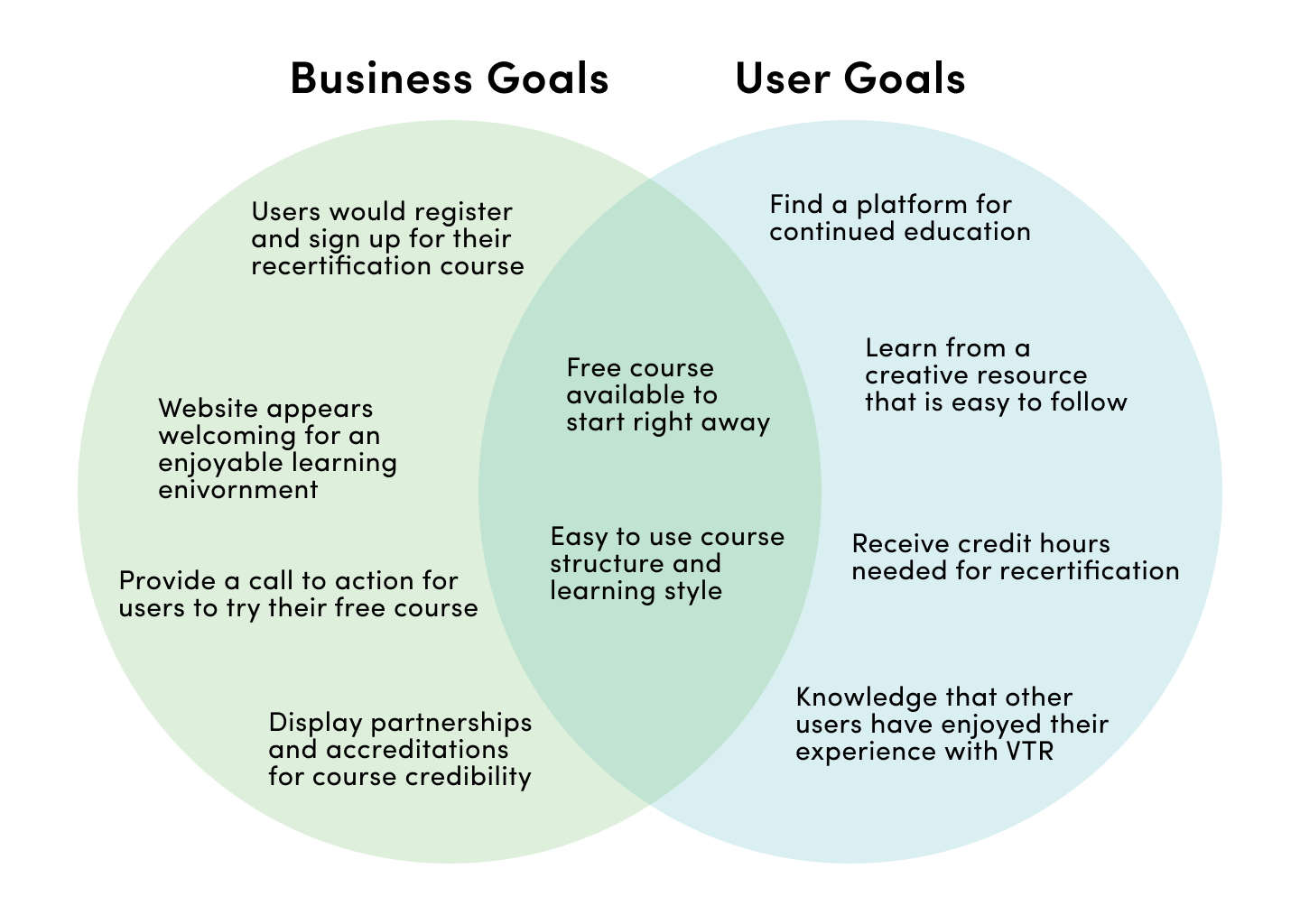
Business and User’s Goals
I also identified business goals from VTR, user goals based on the user persona, and how various business and user goals overlapped.
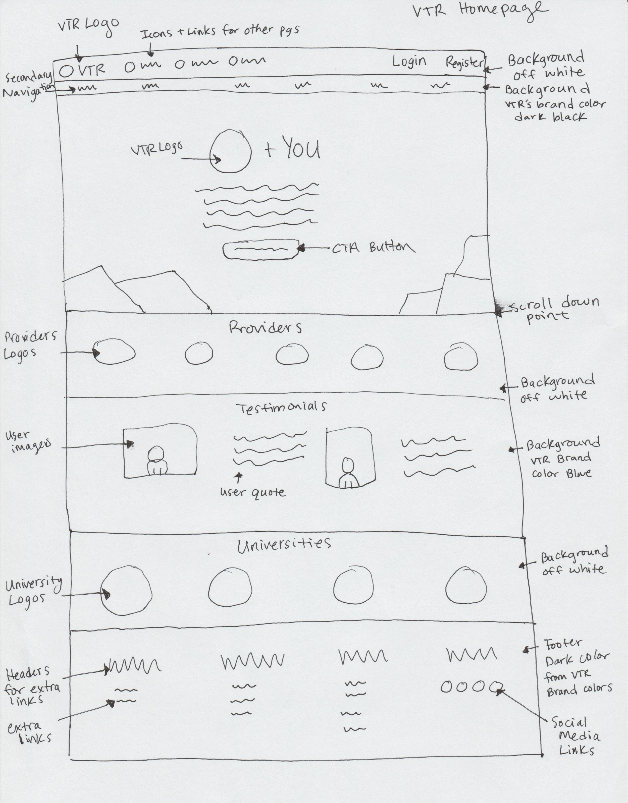
Paper First
The process below begins with my initial ideas with wireframes, then moves to a low fidelity prototype, and finally to the high-fidelity prototype.
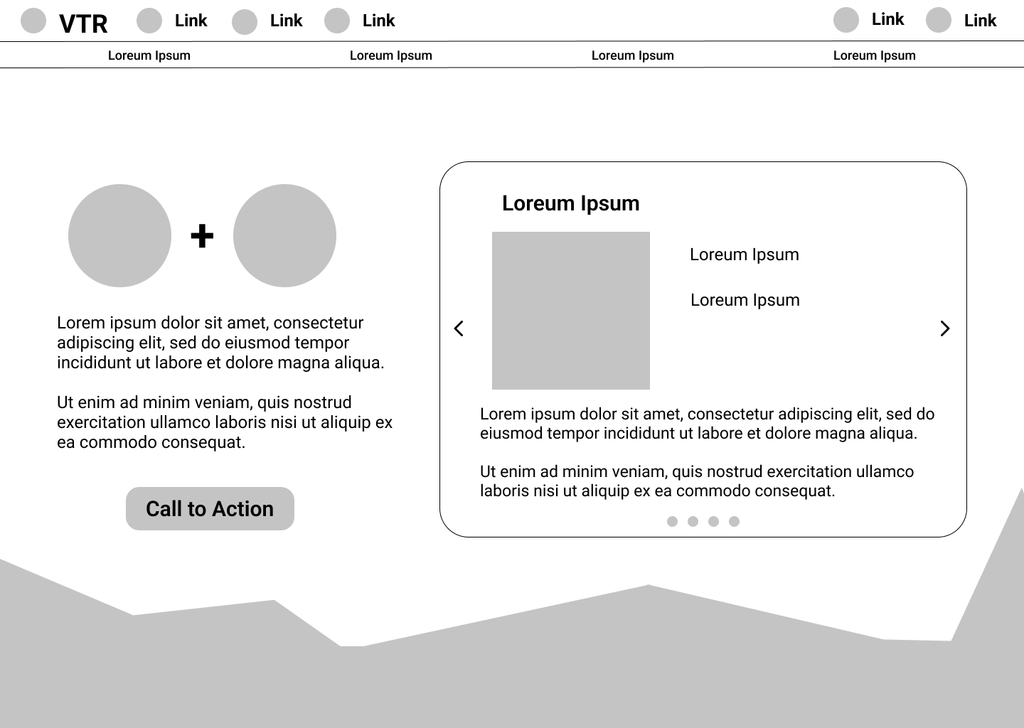
In this initial drawing, I approached solving the users needs by displaying a description of the service VTR provides, a call to action button, who they are accredited by, and user testimonials.
Low-Fidelity Prototype
Upon review of my paper design with my mentor, I created a low-fidelity prototype of the homepage to present my ideas with business stakeholders.
Changes made in low-fidelity protoype after paper design:
- Featured Course Carousel - for prospective users to see a few of the courses VTR offers. The carousel provided the course title, picture, credit number, price, and description.
- More developed approach to the geometric divider - this idea was sparked from the business goal of having a fun and welcoming user experience with the VTR website.
- User Testimonials Carousel - for potential users to see testimonials from users in the past. The carousel created space for more user testimonials to be displayed, and allowed for one professional picture, instead of pictures of users with the testimonials.
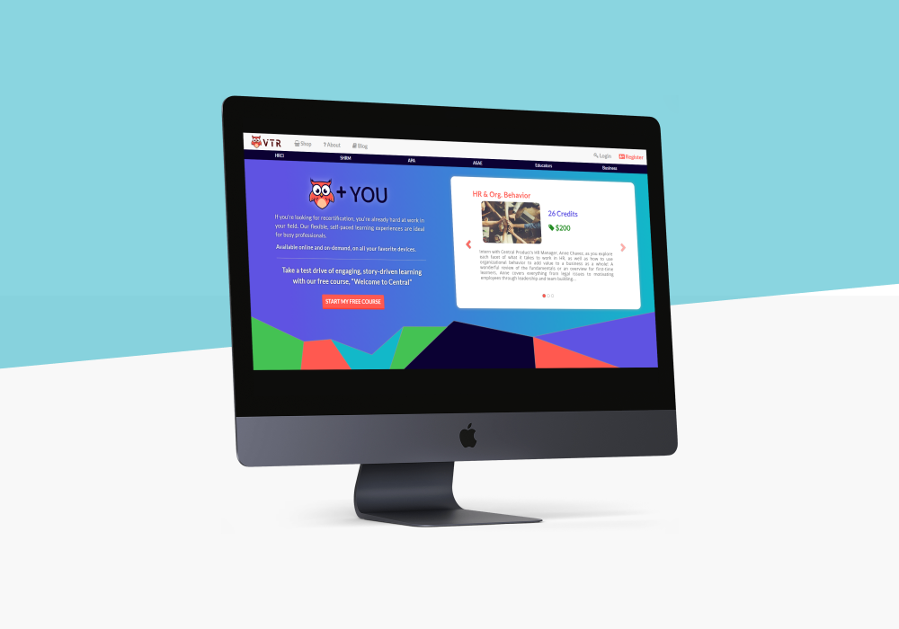
Final Prototype
Below you will see my final designs in this project, and the process of decisions that led to those final design choices.

Design Decisions
1. Secondary Navigation
- Users need to find courses associated with their organization for their recertifications. I decided to design a direct sub-navigation underneath the main navigation that housed sub-pages regarding each organization.
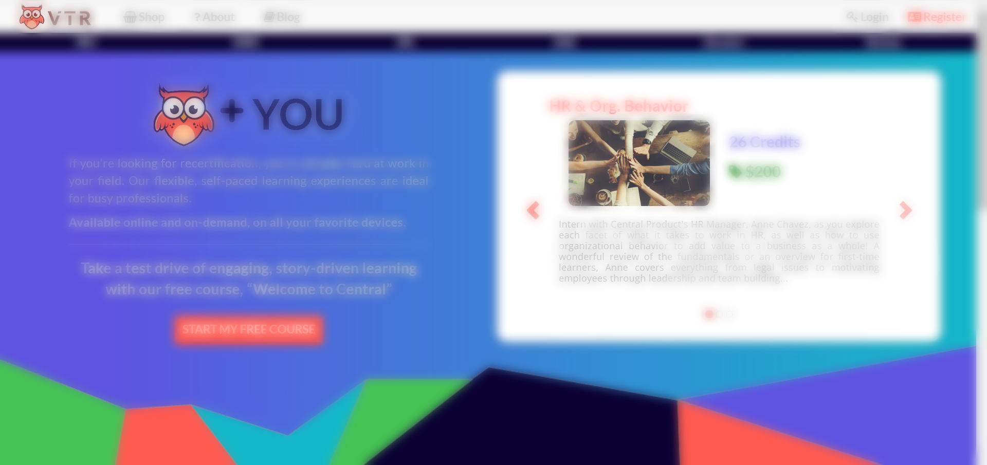
2. Octavia + You
- This section of the page allows for users to gain a clear understanding of what VTR offers users.
3. Free Course
- VTR’s main focus is selling their courses, and users want to know what learning style their courses provide. Through offering this free course, users can experience a sample of the courses.
4. Featured Course Carousel
- This carousel showcases to users with examples of the most popular courses within VTR.
5. Free Course
- I decided to design a fun and welcoming geometric banner on the homepage to imply to users that learning with VTR is enjoyable.
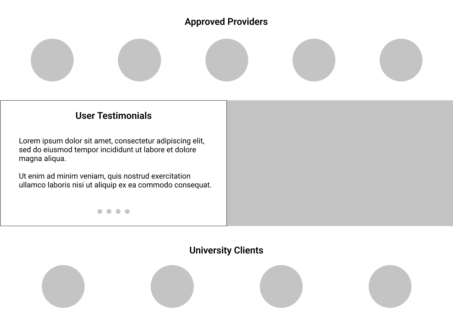
6. Providers
- Users need to find courses associated with their organization for their recertifications. I decided to list the providers here with a link to their organizations website.
7. Customer Testimonials
- Users prefer to see that others have enjoyed and benefited from their experience with VTR.
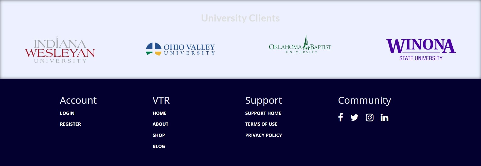
8. University Clients
- VTR is proud of their university partners to continue providing education for the next business professionals.
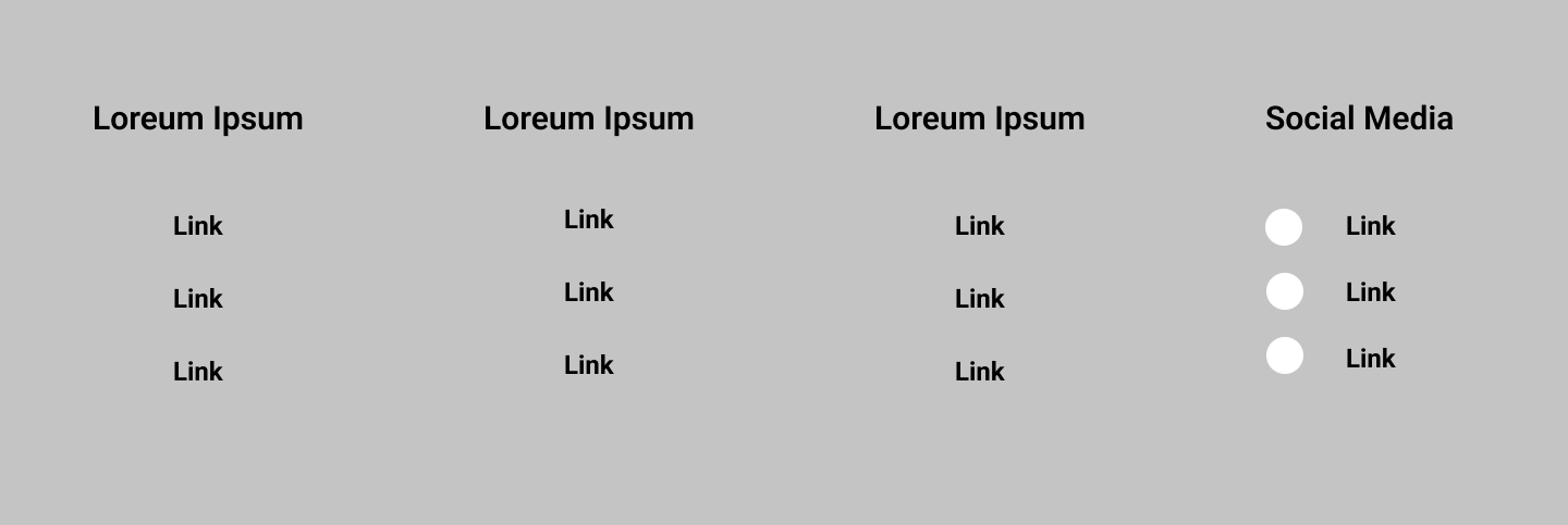
9. Footer
- Industry standard footer for users to have access to support, and community links.
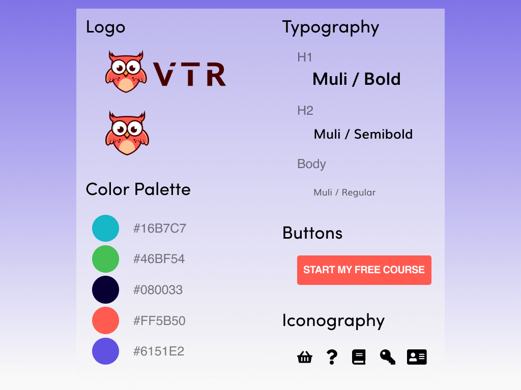
Design System
It was a SUCCESS!
I delivered this website redesign to the client and they were thrilled with the outcome of my work. Users were able to understand the service that VTR provides for continued education. The call to action button on the home screen also provided a place for users to learn more, and for VTR to gain email addresses and insight about their users. Due to the nature of this freelance position with the client, I was not given further user information from website statistics.
More Analysis - Retrospective User Feedback
When I started this project I was hired to create a Website re-design for VTR Learning. Upon reflection of this project and my desire to enter into the field of UX/UI Design, I decided to give my designs to users for feedback. The objective of this user feedback was to discover if my final website design matched with the intention and purpose of the overall original problem statement.
Did these designs solve the problem statement?
Problem Statement: Users needed courses for their continued education that are easy to access, friendly, and applicable to recertifications in their industry from a resource that is welcoming and accredited.
To evaluate if my designs matched my problem statement, I asked users to describe the design in 5 words using this image:
Descriptive Verbiage Evaluation From User Feedback:
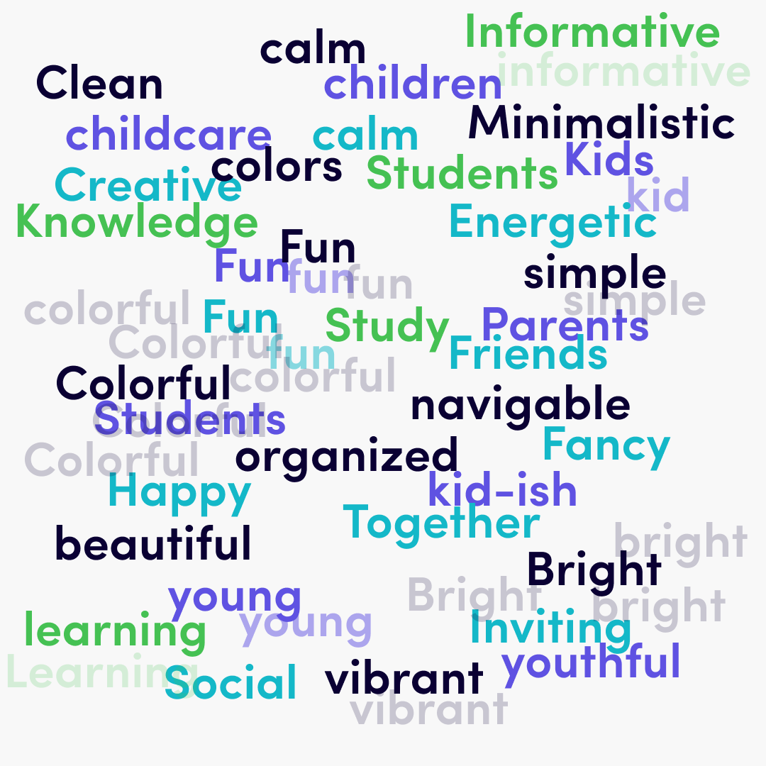
After evaluating all of the words used to describe my design, I grouped the descriptions into different word categories.
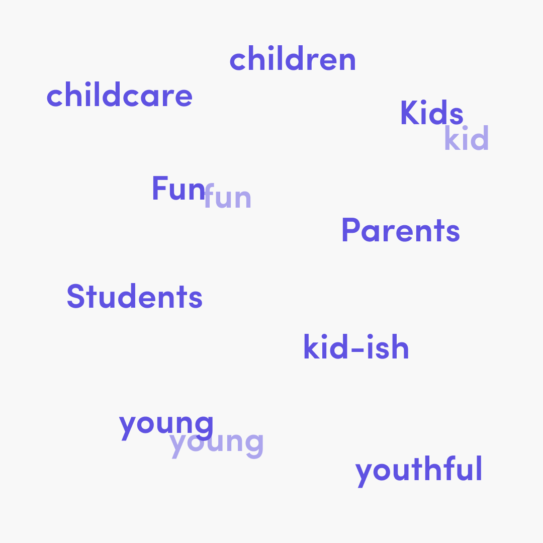
Words that describe that the website is for kids.
Words that describe how a user might feel on the website.
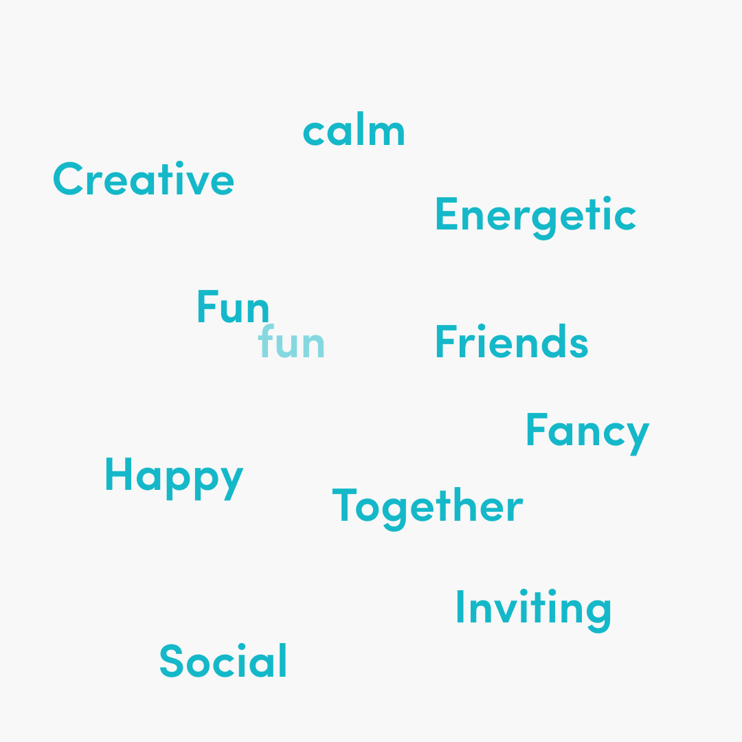
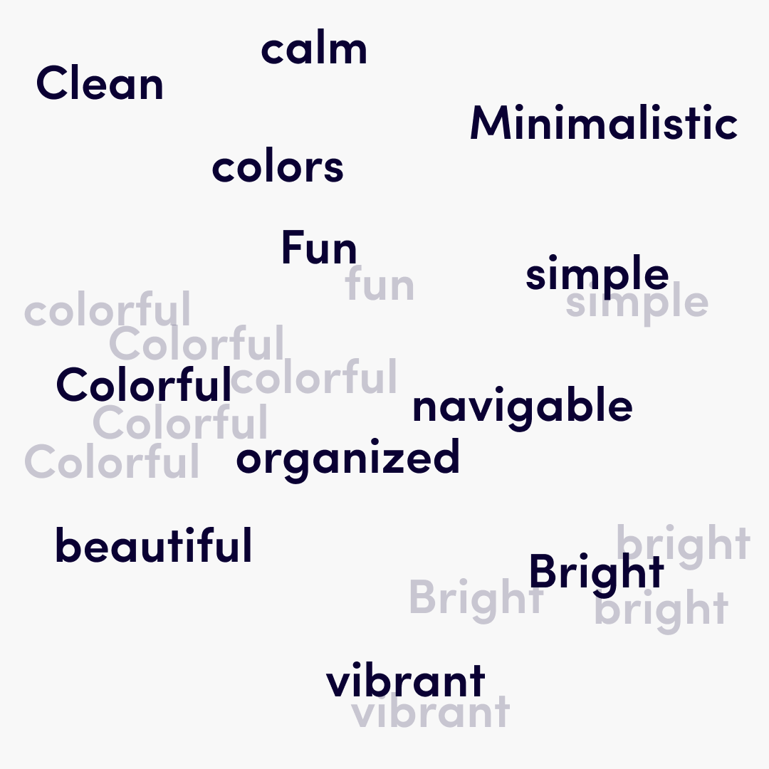
Words that describe the design of the website.
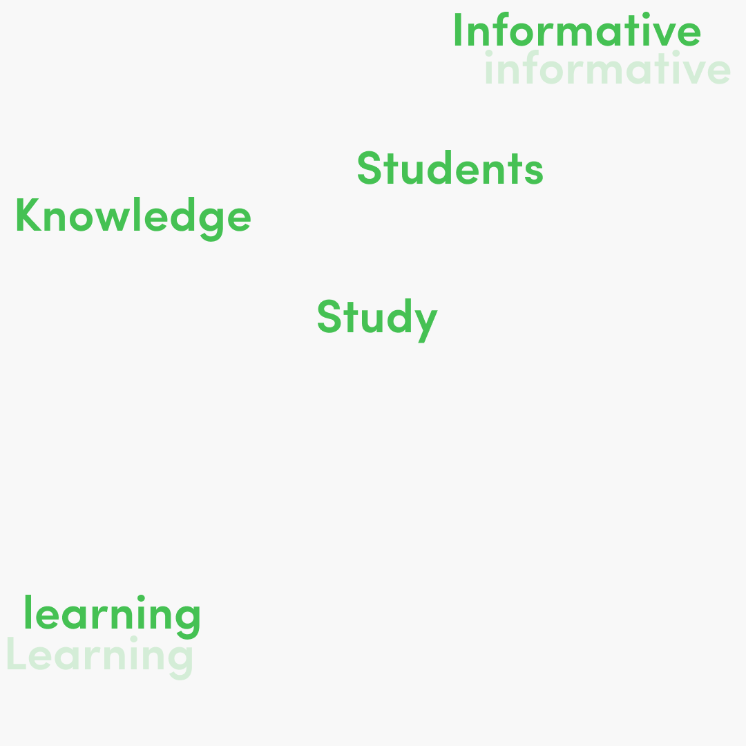
Words that describe that the website is for learning.
Wins
🔥 Bright, Fun, Learning, Informative, Navigable, Inviting
This website met the business objective of “fun and welcoming” through it’s inviting and interesting design. Users also understood that it was a website created for educational purposes. The website navigation was described as “simple, organized, clean, and navigable”.
Losses
👦🏼 Colorful, Children, Kid, Young, Youthful
This website met the business criteria and overall they were satisfied with the product.
Although, from user feedback this website through the use of brand colors implied that the target audience was for a much younger age group of kids. Users also interpreted that the educational aspect of these designs were produced for child-based learning.
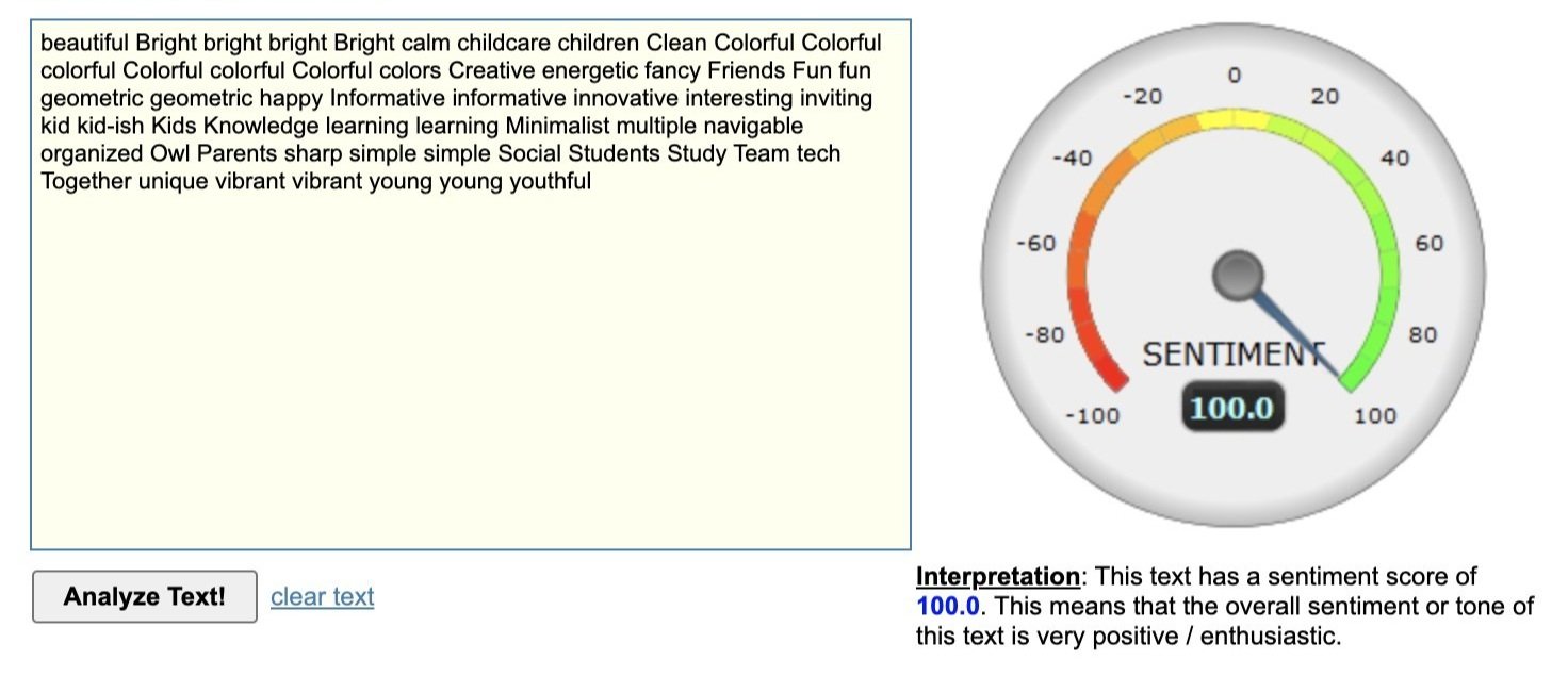
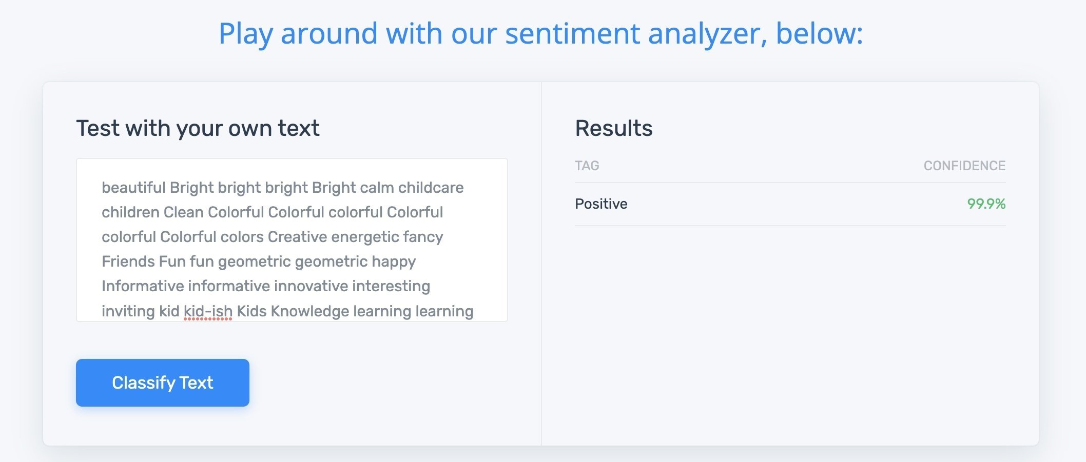
Sentiment Analysis
From the user feedback, I put all of the words the users submitted to describe my designs through two different sentiment analysis programs, which both produced high scores. This concurs that the overall feel of the website met the business of being positive, enthusiastic, and fun.
What I learned.
The user determines if they believe a site is reputable before they determine to sign up to take courses from the site. Overall the user wants to enjoy their continued education for their certificates, and they want to know that their certificate will help them continue in the position they are working in.
User feedback is critical in the design process, and when it was not available, I consulted the business owner and mentors throughout the process before continuing with the design.
What I will change in the future
📝 Utilize more forms of research early on in the design
To have a clearer understanding of the user's interaction with the design, to create a more functional solution, while maintaining the product roadmap. I would analyze website appearance with user testing, to create a better use of color in the design for the target audience.
🖊 Smaller use of multiple colors across entire design
After user research, I discovered the use of colors in my initial design was not geared toward the correct target audience. While the use of colors brings a youthful and fun learning environment appeal, it also detracts from the appeal of business professionals who are interested in their continued education.
In the future, I would add brand colors as highlights for text and points of focus, and less for backgrounds and appeal.