Dashboard Report for Patient Scheduling Team Job/Work Queues
I created an Excel Dashboard to report weekly scheduling work queue numbers to our team and supervisor. For the scheduling team, our work queue is a list of all appointments that need to be scheduled.
In our oncology clinic the scheduling team has a work queue where we have a list of appointments that have been requested by the doctor or nurses to then schedule with the patient. This queue has been significantly difficult to manage, including identifying how the team is doing without breaking the entire work queue down into multiple sections, since there's a lot (our active queue typically has anywhere from 1,500 - 2,000) of appointment requests at any given time.
Overview:
Project: Dashboard Report for Tracking Team Workqueue Numbers
Software: Excel: Pivot Tables, Pivot Charts
Skills: Combining and Cleaning Data, Data Visualization with Excel
Problem:
Our team was looking at raw data on a week-to-week basis, struggling to identify and comprehend how the numbers relate to each other across multiple tables in an excel sheet.
Solution:
I created one dashboard that displays all of the scheduling work queue information we have been tracking. On the dashboard I use a combination of pivot tables and pivot charts, to display the data in a way that is easy to navigate and interpret.
Why was this dashboard desperately needed?
The raw data in the previous excel spreadsheet was…
- Difficult to interpret and digest into understandable comparisons
- Difficult for the viewing user to gain actionable insights from the data
- Hard to see how the data has changed over time
- There were multiple tables and multiple sheets of data leading to eyes darting around to make sense of what the number was previously
Additionally, our team leader would get asked periodically to explain where the team was at, and how we were doing with our numbers but there was no actionable insight we could easily gain from the previous spreadsheet.
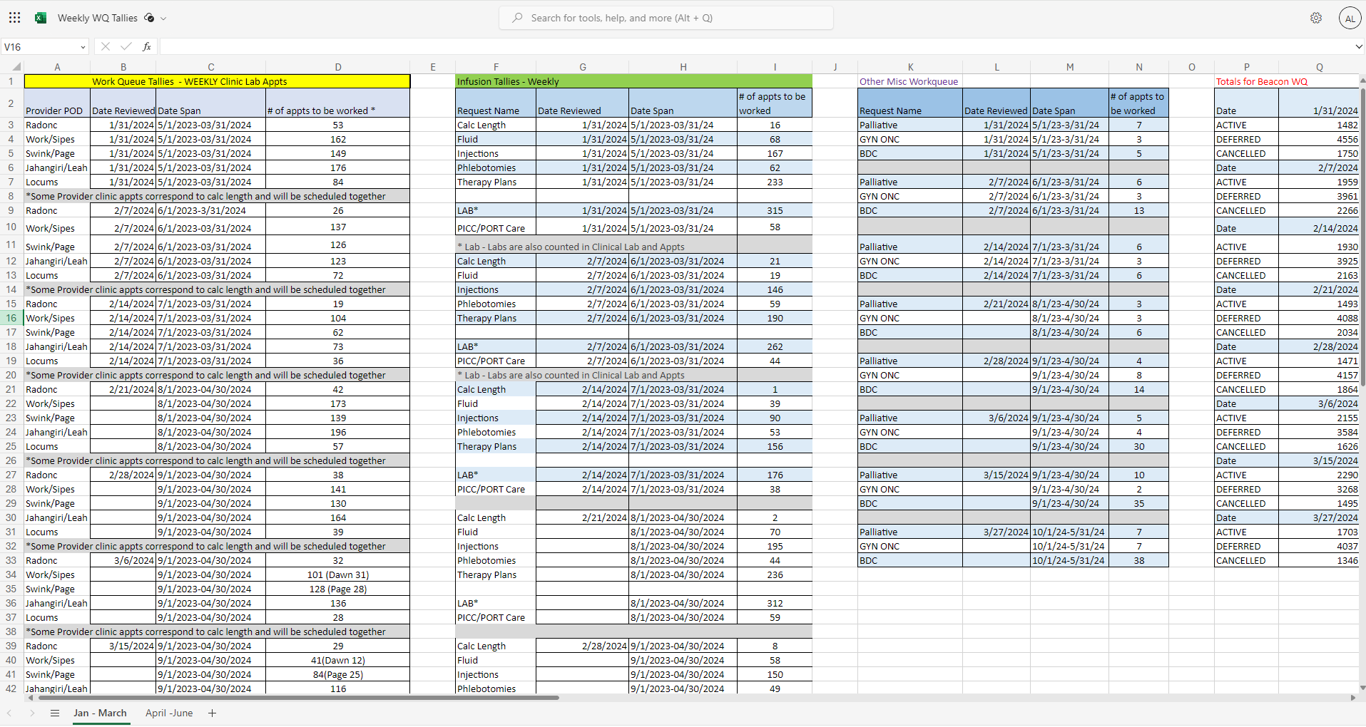
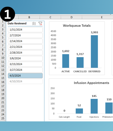
The Old Data Tracking Spreadsheet
What was being used previously
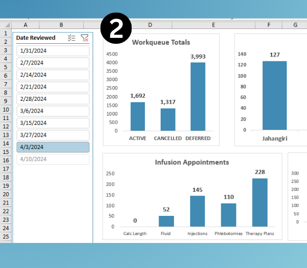
Compared to the New Data Tracking Spreadsheet
This dashboard, in my humble opinion, is much easier to read, understand, and take insights away from.
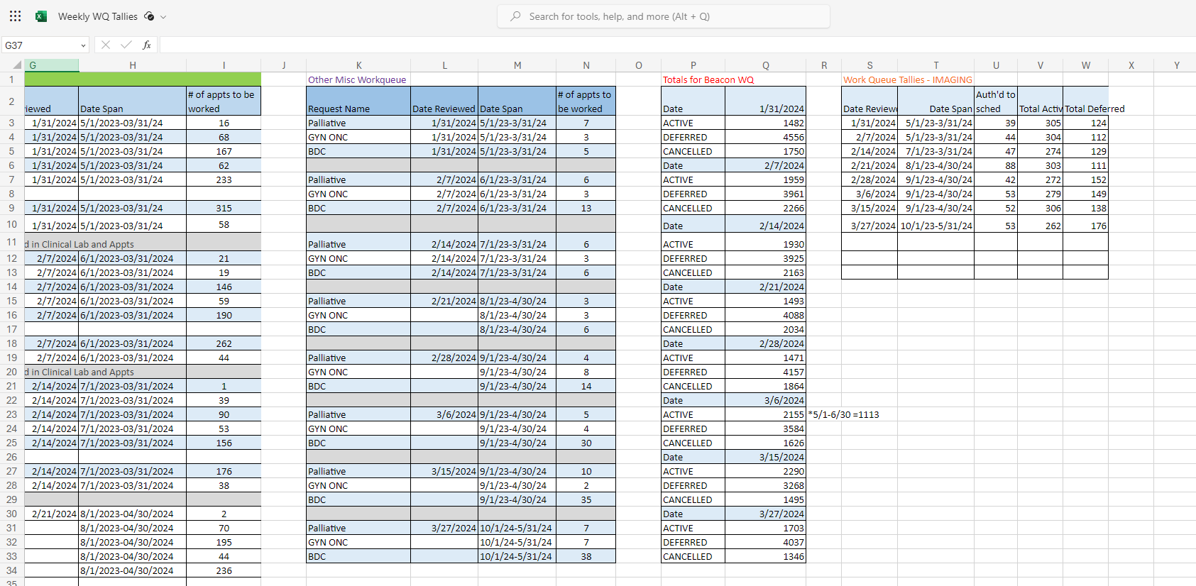
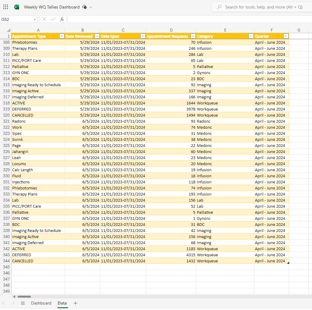
Where is the Data Stored?
I created a seperate sheet in the excel document to store the data that is being pulled into the dashboard.
The Methodology of Design
More information on why I chose this design layout
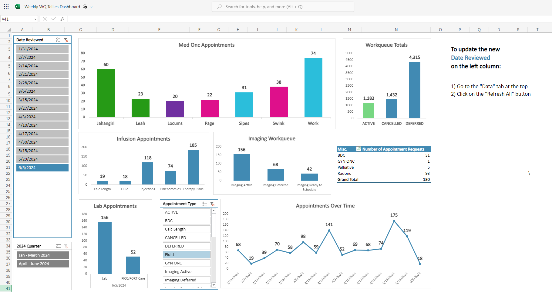
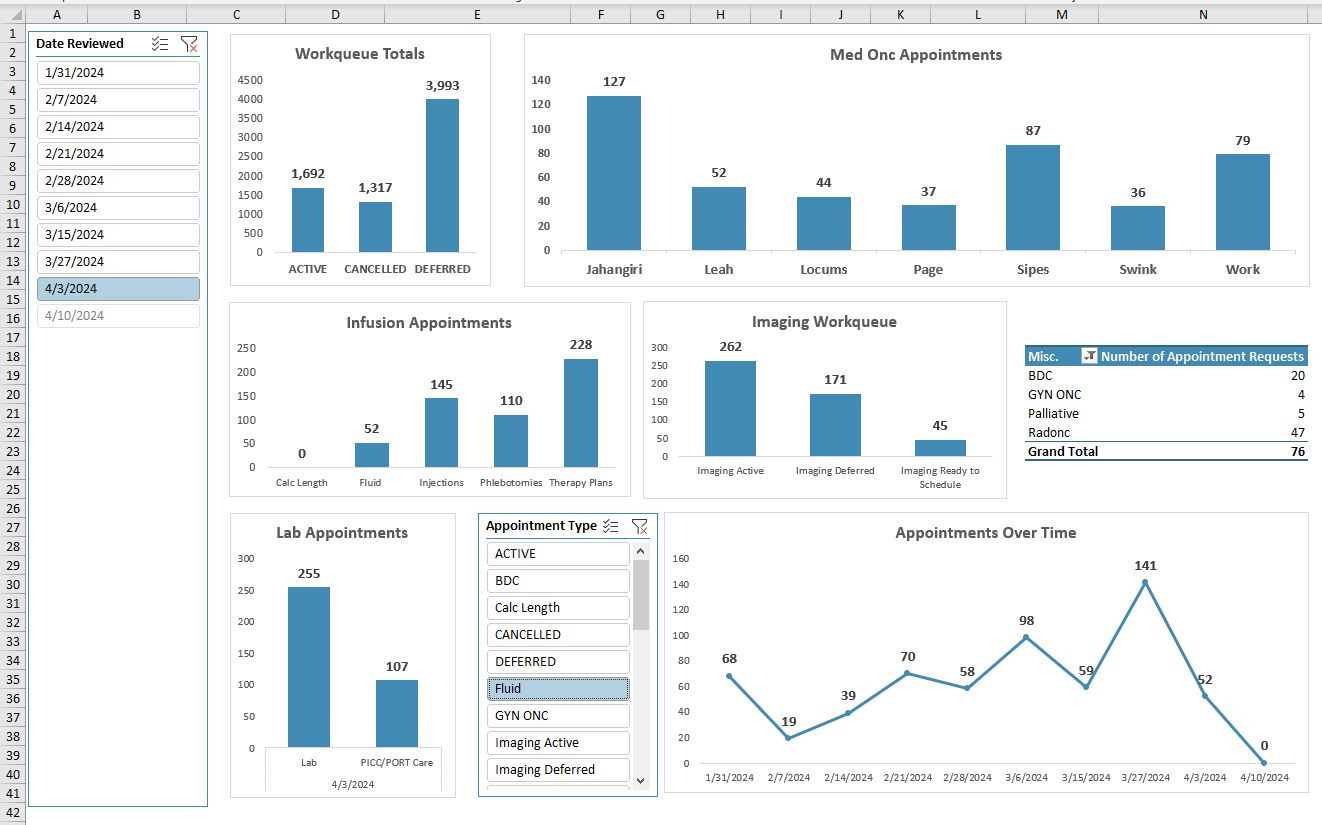
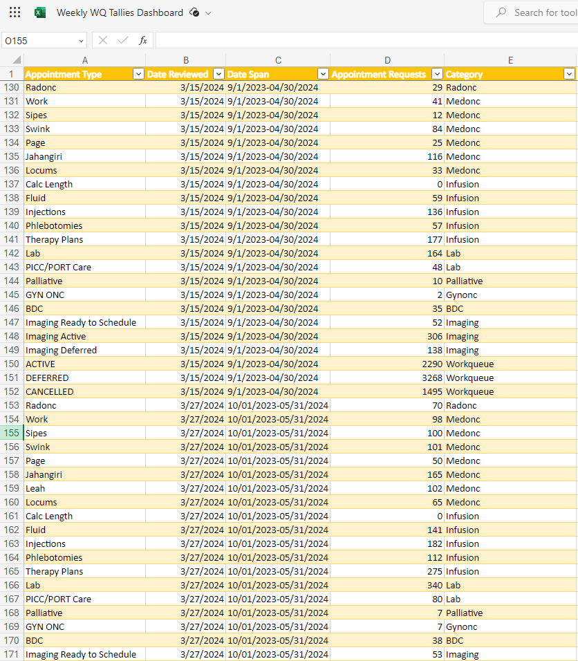
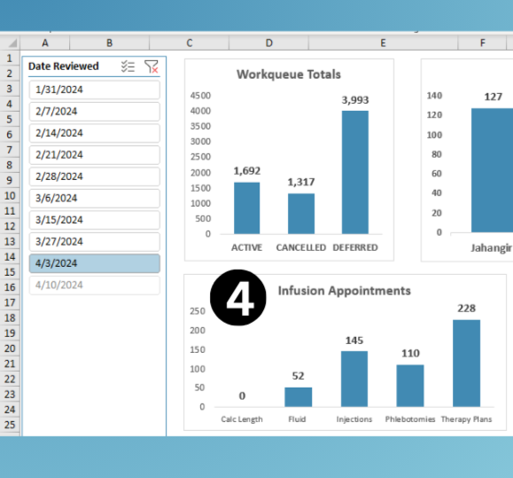
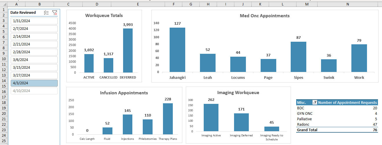
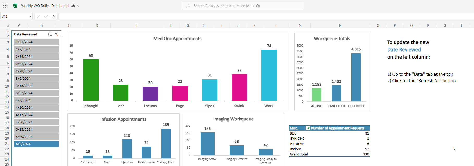
1. Date Reviewed
Using the date reviewed column on the left side, you can easily switch between the weeks looking at the most recent data, or the data that was reported 5 weeks ago. As we add more data into our table, the column will grow with future dates, so we can easily switch back and forth to examine the data.
2. Total Number of Appointment Requests
Since we read left to right, I started with the largest metrics we measure weekly, which is our total number of appointment requests in our active, canceled, and deferred work queues.
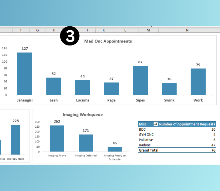
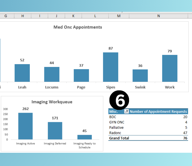
3. Medical Oncology (Med Onc) Appointments
From there, I decided to show the Medical Oncology (Med Onc) Appointments next because everyone on our scheduling team schedules Med Onc Appointments, and our providers and their patients are central to our oncology center.
4. Infusion Numbers
Next I chose to display Infusion Numbers because we have a lot of patients, both oncology and outside patients that receive treatment in our infusion center.
5. Imaging Work Queue
For our Imaging Work Queue - in our scheduling team, we only schedule Imaging (CT’s, MRI’s, Ultrasounds, Mammograms, etc.) for our patients, which is continuing to narrow the focus for the dashboard.
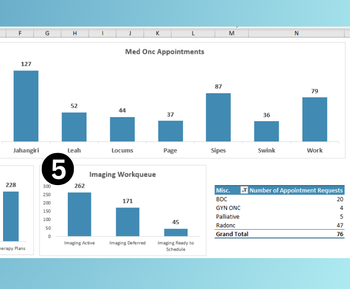
6. Table of Misc. Appointments
I chose to display a Table of Misc. Appointments, because we have a blood disorder clinic (BDC), two gynecologist oncologists, palliative care, and radiation oncology providers which the numbers for are standalone and are not easily compared to anything else.
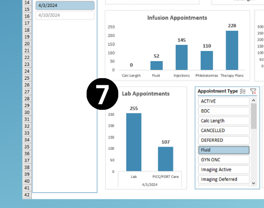
First Iteration
This was my first iteration of the project, except I had the lab and port picc care appointments in the Table of Misc. Appointments.
Disclaimer: I did not get a screenshot of this, but it was exactly the same as below except for the lab and port/picc care appointment being in that misc. table
Once I finished this stage of the project, I asked for feedback from my team leader Hallie and supervisor Vanessa, and Vanessa mentioned that she would like to see the lab and port/picc appointment requests with the infusion numbers.
Second Iteration
Improved existing dashboard with supervisor’s feedback
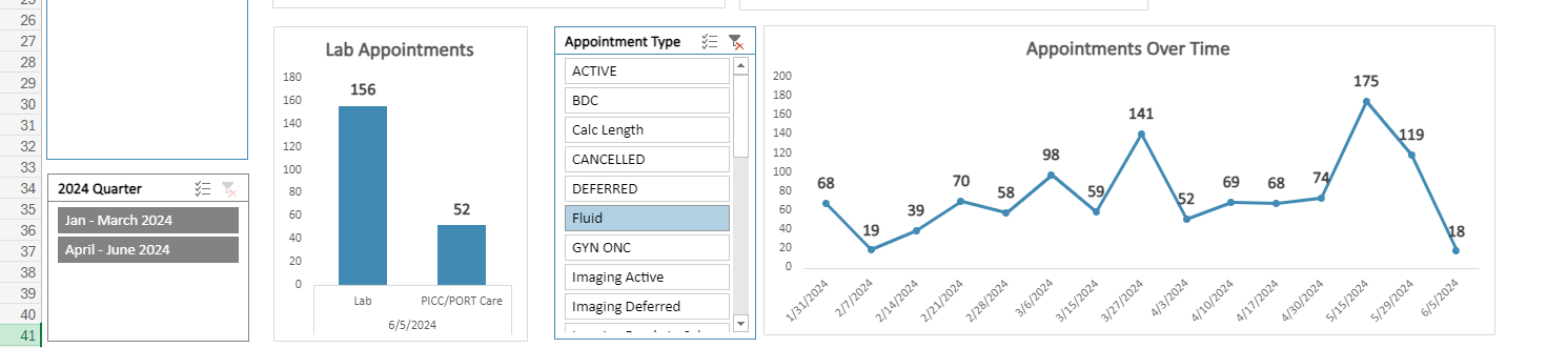
7. Lab Appointments
We have a stand alone lab with its own appointments, along with our infusion center and since lab appointments <> (do not equal) infusion appointments, I decided to make Lab Appointments its own chart.
8. Filtering the Data Timeline
For those who have access to the dashboard spreadsheet, they can manipulate the filter on their computer and see how the data changes over time and across the different appointment types.
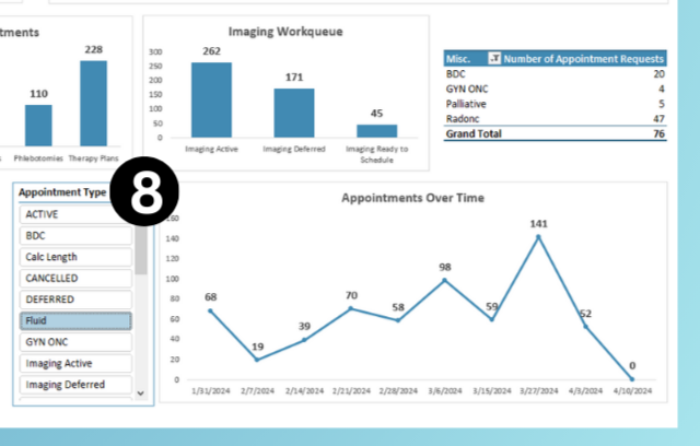
9. Appointments Timeline
I had also asked my team leader Hallie if she would be interested to see how the numbers changed over time. She said yes, and I made the Appointments Over Time line graph with filtered data from Number 8 - to the left of the line chart.
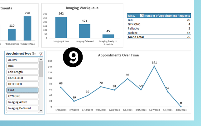
Note: 4/10/24 is listed as 0 in this data chart because I have made the rows for this date, but I made this spreadsheet on 4/08/24 and at the time the data for 4/10/24 had not been entered.
Secure the Data
Hopefully nobody knows where the ctrl + alt + delete buttons are…
While it’s not likely someone in our team would tamper with the data, or accidentally delete it… I went ahead and locked the data part of the spreadsheet from being edited from anyone except myself, my team leader, or my supervisor.
This makes sure that nobody is editing the data that doesn't need to be editing it.
Feedback From My Team and Leadership
For improving our data tracking and reporting with this dashboard
- It’s so much easier for me to understand!
- My brain understands and works much better this way (in pictures and charts) than with numbers in a table
- I love the visual respresentation of the data. It helps my brain process all the numbers.
Third Interation
Colors & Hierarchy
After showing this to my mentor for more feedback, she emphasized that color would draw the attention to different areas, and that I could use the colors and orientation of the dashboard to help them see even more meaningful data.
For example: On the Medonc Clinic Appointments, the nurse practicioner and the doctor work closely together, making them groups of two.
- Dr. Work and Dawn
- Dr. Swink and Page
- Dr. Jahangiri and Leah
I also moved the workqueue totals to the right since that information is the largest totals we have, but it is also less important than the Med Onc Appointments. We only work out of the "Active" Workqueue, therefore I colored this section of the bar graph in green.
Temporary vs. Sustainable?
The last thing I changed in Iteration 3 will hopefully be a change that will make this dashboard more sustainable and a long-term tool.
I created a "How to Refresh the Data" Section for people who are updating the spreadsheet in the future (this could potentially be differnt people) and want to see future dates updated on the dashboard.
I created a column in the data to filter it out by quarter of the year. After some time, we might decide to only show quarters at a time rather than week-to-week. I wanted us to have the flexibility to see that, and added that to filter our dashboard when selected.
What the data looks like with the new changes
Conclusion
I believe this project was a huge success for our data reporting and understanding needs for our work queues that we manage as a team.
My team leader and supervisor asked if they could start implementing it right away (even after just the first iteration).